
It can feel like a daunting task when you have a > 20 variables to find the few variables that you actually “need”. In this article I describe how the singular value decomposition (SVD) can be applied to this problem. While the traditional approach to using SVD:s isn’t that applicable in my research, I recently attended Jeff Leek’s Coursera class on Data analysis that introduced me to a new way of using the SVD. In this post I expand somewhat on his ideas, provide a simulation, and hopefully I’ll provide you a new additional tool for exploring data.
The SVD is a mathematical decomposition of a matrix that splits the original matrix into three new matrices (A = U*D*V). The new decomposed matrices give us insight into how much variance there is in the original matrix, and how the patterns are distributed. We can use this knowledge to select the components that have the most variance and hence have the most impact on our data. When applied to our covariance matrix the SVD is referred to as principal component analysis (PCA). The major downside to the PCA is that you’re new calculated components are a blend of your original variables, i.e. you don’t get an estimate of blood pressure as the closest corresponding component can for instance be a blend of blood pressure, weight & height in different proportions.
Prof. Leek introduced the idea that we can explore the V-matrix. By looking at the maximum row-value from the corresponding column in the V matrix we can see which row has the largest impact on the resulting component. If you find a few variables that seem to be dominating for a certain component then you can focus your attention on these. Hopefully these variables also make sense in the context of your research. To make this process smoother I’ve created a function that should help you with getting the variables, getSvdMostInfluential() that’s in my Gmisc package.
A simulation for demonstration
Let’s start with simulating a dataset with three patterns:
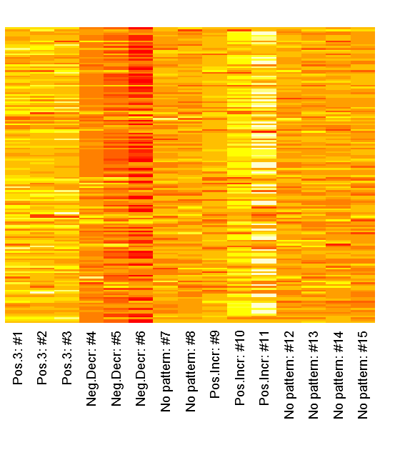
1 2 3 4 5 6 7 8 9 10 11 12 13 14 15 16 17 18 19 20 21 22 23 24 25 26 27 28 29 30 31 32 | set.seed(12345); # Simulate data with a pattern dataMatrix <- matrix(rnorm(15*160),ncol=15) colnames(dataMatrix) <- c(paste("Pos.3:", 1:3, sep=" #"), paste("Neg.Decr:", 4:6, sep=" #"), paste("No pattern:", 7:8, sep=" #"), paste("Pos.Incr:", 9:11, sep=" #"), paste("No pattern:", 12:15, sep=" #")) for(i in 1:nrow(dataMatrix)){ # flip a coin coinFlip1 <- rbinom(1,size=1,prob=0.5) coinFlip2 <- rbinom(1,size=1,prob=0.5) coinFlip3 <- rbinom(1,size=1,prob=0.5) # if coin is heads add a common pattern to that row if(coinFlip1){ cols <- grep("Pos.3", colnames(dataMatrix)) dataMatrix[i, cols] <- dataMatrix[i, cols] + 3 } if(coinFlip2){ cols <- grep("Neg.Decr", colnames(dataMatrix)) dataMatrix[i, cols] <- dataMatrix[i, cols] - seq(from=5, to=15, length.out=length(cols)) } if(coinFlip3){ cols <- grep("Pos.Incr", colnames(dataMatrix)) dataMatrix[i,cols] <- dataMatrix[i,cols] + seq(from=3, to=15, length.out=length(cols)) } } |
We can inspect the raw patterns in a heatmap:
1 | heatmap(dataMatrix, Colv=NA, Rowv=NA, margins=c(7,2), labRow="") |
Now lets hava a look at how the columns look in the V-matrix:
1 2 3 4 5 6 7 8 9 10 11 12 13 14 15 16 17 18 19 20 21 22 23 24 25 26 27 28 29 30 31 32 33 34 35 36 37 38 39 40 41 42 43 44 45 46 47 | svd_out <- svd(scale(dataMatrix)) library(lattice) b_clr <- c("steelblue", "darkred") key <- simpleKey(rectangles = TRUE, space = "top", points=FALSE, text=c("Positive", "Negative")) key$rectangles$col <- b_clr b1 <- barchart(as.table(svd_out$v[,1]), main="First column", horizontal=FALSE, col=ifelse(svd_out$v[,1] > 0, b_clr[1], b_clr[2]), ylab="Impact value", scales=list(x=list(rot=55, labels=colnames(dataMatrix), cex=1.1)), key = key) b2 <- barchart(as.table(svd_out$v[,2]), main="Second column", horizontal=FALSE, col=ifelse(svd_out$v[,2] > 0, b_clr[1], b_clr[2]), ylab="Impact value", scales=list(x=list(rot=55, labels=colnames(dataMatrix), cex=1.1)), key = key) b3 <- barchart(as.table(svd_out$v[,3]), main="Third column", horizontal=FALSE, col=ifelse(svd_out$v[,3] > 0, b_clr[1], b_clr[2]), ylab="Impact value", scales=list(x=list(rot=55, labels=colnames(dataMatrix), cex=1.1)), key = key) b4 <- barchart(as.table(svd_out$v[,4]), main="Fourth column", horizontal=FALSE, col=ifelse(svd_out$v[,4] > 0, b_clr[1], b_clr[2]), ylab="Impact value", scales=list(x=list(rot=55, labels=colnames(dataMatrix), cex=1.1)), key = key) # Note that the fourth has the no pattern columns as the # chosen pattern, probably partly because of the previous # patterns already had been identified print(b1, position=c(0,0.5,.5,1), more=TRUE) print(b2, position=c(0.5,0.5,1,1), more=TRUE) print(b3, position=c(0,0,.5,.5), more=TRUE) print(b4, position=c(0.5,0,1,.5)) |
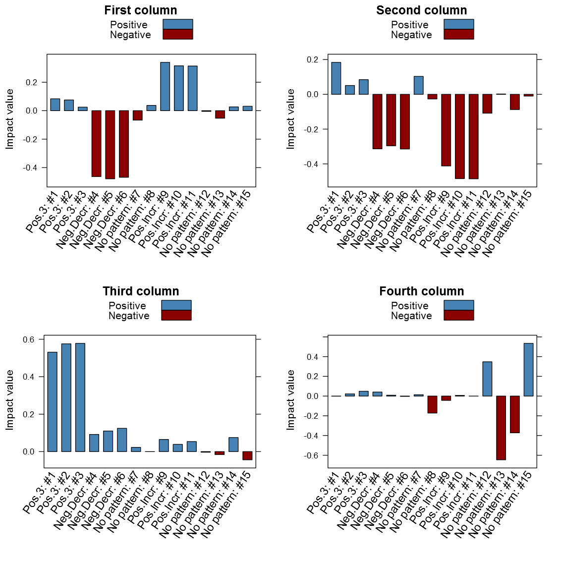
It is clear from above image that the patterns do matter in the different columns. It is interesting is that the close relation between similar patterned variables, it is also clear that the absolute value seems to be the one of interest and not just the maximum value. Another thing that may be of interest to note is that the sign of the vector alternates between patterns in the same column, for instance the first column points to both the negative decreasing pattern and the positive increasing pattern only with different signs. I’ve created my function getSvdMostInfluential() to find the maximum absolute value and then select values that are within a certain percentage of this maximum value. It could be argued that a different sign than the maximum value should be more noticed by the function than one with a similar sign, but I’m not entirely sure how I to implement this. For instance in the second V-column it is not that obvious that the positive +3 pattern should be selected instead of the negative decreasing pattern. It will anyway appear in the third V-column…
Now to the candy, the getSvdMostInfluential() function, the quantile-option give the percentage of variables that are explained, the similarity_threshold gives if we should select other variables that are close to the maximum variable, the plot_threshold gives the minimum of explanatory value a V-column mus have in order to be plotted (the D-matrix from the SVD):
1 2 3 4 5 | getSvdMostInfluential(dataMatrix, quantile=.8, similarity_threshold = .9, plot_threshold = .05, plot_selection = TRUE) |
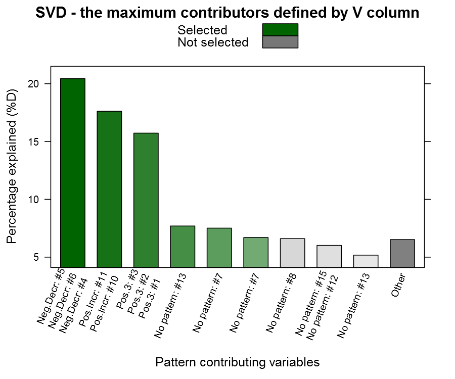
You can see from the plot above that we actually capture our patterned columns, yeah we have our needle ![]() The function also returns a list with the SVD and the most influential variables in case you want to continue working with them.
The function also returns a list with the SVD and the most influential variables in case you want to continue working with them.
A word of caution
Now I tried this approach on a dataset assignment during the Coursera class and there the problem was that the first column had a major influence while the rest were rather unimportant, the function did thus not aid me that much. In that particular case the variables made little sense to me and I should have just stuck with the SVD-transformation without selecting single variables. I think this function may be useful when you have a many variables that your not too familiar with (= a colleague dropped a database in your lap), and you need to do some data exploring.
I also want to add that I’m not a mathematician, and although I understand the basics, the SVD seems like a piece of mathematical magic. I’ve posted question regarding this interpretation on both the course forum and the CrossValidated forum without any feedback. If you happen to have some input then please don’t hesitate to comment on the article, some of my questions:
- Is the absolute maximum value the correct interpretation?
- Should we look for other strong factors with a different sign in the V-column? If so, what is the appropriate proportion?
- Should we avoid using binary variables (dummies from categorical variables) and the SVD? I guess their patterns are limited and may give unexpected results…
R-bloggers.com offers daily e-mail updates about R news and tutorials on topics such as: visualization (ggplot2, Boxplots, maps, animation), programming (RStudio, Sweave, LaTeX, SQL, Eclipse, git, hadoop, Web Scraping) statistics (regression, PCA, time series,ecdf, trading) and more...