Quantcast
Channel: Search Results for “pca”– R-bloggers
Viewing all 209 articles
Browse latest View live

SMART Hackathon: Day 2: Writing Packages in RStudio

$
0
0

(This article was first published on A HopStat and Jump Away » Rbloggers, and kindly contributed to R-bloggers)

So day 2 of the #JHUSMARTHack was last week, but I figured this would be a good time to discuss what was accomplished. I created some packages that are somewhat specialized and aren't fully finished yet, so I'll hold off. What I really want to discuss though is why I like using RStudio for making packages.

What was accomplished?

I had spoken before about the repositories I had worked on, and also about Developing Packages in RStudio. I'll discuss the workflow I settled into for for making a package.

Workflow for an R package

I'm assuming your R code is already available, presumably functions you had created during a project or analysis. If code is not available, GREAT! You can start your workflow for your new package or product all the same. I'll try to put command-line equivalents in double brackets [[ ]].

Workflow:

  1. Start RStudio.
  2. Go to File -> New Project. (Save any unsaved work).
  3. Select New Directory. Now this may be counterintuitive if you have work saved, but if you're creating a package choose this. This will setup a new folder and copy over any code you have already created.
  4. Select R Package. This will allow you to name your package (it will be used in the library statement unless changed later); let's call it mypckg. You can also choose code you have to operationalize, e.g. put into a package. Also – select you want to create a git repository.
  5. Voila! The folder is created where you have the components of an R package, such as the documentation (man), extra install dir (inst), the R code (R), etc. [[library(devtools); create("mypckg");]]

Now, here is one of the main reasons I like using RStudio for projects: the .Rproj file. The .Rproj file is an RStudio project file. It allows you to work on stuff in multiple tabs/scripts, then close the project, and pop up the other tabs/scripts you were working on before opening up that project. If you are in RStudio, the top right should show a Project: None if you don't have a project loaded. These project files allows me to segregate my workflows and scripts, and they help me organize a bit more. I highly recommend checking out Hilary Parker's post before continuing, especially if you're not an RStudio fan.

Using RStudio Build Tools

Now, when I say RStudio Build Tools, I essentially mean wrappers for the devtools package. The package is amazing (hardly shocking since Hadley Wickham is the main author), and along with the roxygen2 package, allow package creation to be as easy as possible.

Now, let's set up our options for Build Tools. In RStudio, go to Build -> Configure Build Tools (again you must be in an RStudio project). For Check Package, I recommend putting the --as-cran option (especially if you plan to submit to CRAN. You should also see a checkbox saying Generate documentation using Roxygen. If this is not available, run install.packages("roxygen2"), close and reopen the project. Check this box, and click the Configure button and I usually click all options.

Setting up a remote git repository

Before, we checked for a git repository to be created. Now, you can create a new repository in your favorite GitHub remote repository. Mine is GitHub. You can use the GUIs such as the GitHub GUI or SourceTree, but I generally set this up using the Terminal by just adding the remote. (Here is a link to create ssh keys so you don't have to type in passwords for git). Now, if you restarted the RStudio project, go to Build -> Configure Build Tools and you should see the remote repository if you click the Git/SVN tab.

Now that the repository is set up (even if you don't use a remote repository), you can go to Tools --> Commit to commit to the repository. This allows you to add and stage the changed files while adding a commit comment. You can also see a visual history of the differences and changes as well as do much of what you would need to from the command line. Again, I like the Terminal, but I like having this all in one program and not having to switch back and forth.

DOCUMENTATION! EXAMPLES! VIGNETTES!

Now that you have everything set up, you have to do the big things that differentiate a bunch of functions from a package: documentation and examples (including vignettes). Again, for documentation, we'll be using the roxygen2 package. Roxygen is essentially a format that starts with a line with #' followed by @ followed by a “tag”. The tags can be found at ?rd_roclet. Now, I highly recommend vignettes, but I'm not an expert on these and think we'll just stick to function docs right now.

Jumping to Sublime Text

Before we start documentation, let me again tell about MY workflow rather than Roxygen. My workflow now jumps to Sublime Text. I have Line-by-line installed (which you will need), which allows me to run a script to parse an R function and create the necessary Roxygen tags. See Alyssa's post for the description and a more command-line workflow for R packages.

Now that we're in Sublime Text, I open the .R files from my packages R directory. Select the function definition such as x = function(z, y, l=4, ...){ and use CMD+D to create Roxygen tags! This is like meta-programming for documentation: running scripts to make documentation (granted it's in Python). As an aside, one powerful feature of this documentation is that if you have code as:

LFPCAg <- function(
Y,# an n x D matrix
                   # Y is assumed to be centered by its mean function
                   gridpoints = 1:ncol(Y),       # a vector of grid points along curves, corresponding to columns of Y 
                   Zlist=NA,
                   G=NA,
                   Ivec=NA,
                   ...){

this will parse the Roxygen tags as the comments for each argument/parameter (even if multi-line!):

#' @title <brief desc>
#'
#' @description <full description>
#' @param Y an n x D matrix Y is assumed to be centered by its mean function
#' @param gridpoints a vector of grid points along curves corresponding to columns of Y
#' @param Zlist
#' @param G
#' @param Ivec
#' @param ... 
#' @export
#' @keywords
#' @seealso
#' @return
#' @aliases
#' @examples \dontrun{
#'
#'}

This also puts in your mind, even if you're only creating functions and not a package, that you'll almost have documentation ready made when using this function format from day 1.

Jumping Back to RStudio

Now, opening these Roxygen-tagged functions, I can fill in the rest in RStudio. One thing to note is that RStudio will assume you're trying to stay in Roxygen notation with a return of line (which is great for multi-line descriptions/titles/etc). Also, if you have #' @ starting a line, then RStudio will do tab completion of Roxygen tags. Not leaps and bounds saved on time, but hey, I like tab completion.

Now you have to write your examples, the description of arguments (denoted as parameters), the overall function description and title, and use the @export to allow this function accessible to the user. One note is that if you depend on another function or package, use the @import pkgname or @importsFrom pkgname::funcName tags. R CMD check will warn you if you don't have anything in @keywords, @aliases, or @examples, so remove these if not necessary.

Just let me check my functions!

If you're still working on the package and want to play with functions and no so much the documentation, you can use Build -> Load All [[devtools::load_all]] to load the functions (even those not exported) into memory.

Compile and Load

Now let's fast-forward to when you have created the the documentation for your functions. While still in your project, go to Build -> Build and Reload to get your package loaded into memory [[devtools::build then devtools::install]]. Roxygen will create the docs. FYI – if you change around function names and recompile, the man folder may have obsolete .Rd files, so you can delete old ones.

You should edit the DESCRIPTION file to change some specifications, such as Depends: fields for package dependencies. That's documented many places on the web to find about what goes in there.

Now edit your functions and docs, push to the remote repository and then allow people install your package by using:

library(devtools)
install_github("mypckg", "myGitHubUserName")

and there you have it – you've released software. Build -> Check Package is good for testing your package (will tests your examples) and make sure everything looks OK.

Conclusion

R package creation seems like a daunting task. You can use tools in RStudio such as Code -> Extract Function to take loads of code to try to functional-ize it. When you have a collection of functions, creating an RStudio project allows you to separate your package creation process from regular RStudio analysis and use, let's you have a one-stop shop for git version control, building, and checking of packages. It let's you get over any hurdles of learning new functions in devtools (which may not be a good thing) and get you running in a short amount of time. The Sublime Text plugin is not a crucial step, but can allow you to parse semi-documented functions and create a Roxygen header that's partially filled in. This workflow allowed me to develop multiple projects and get them documented quickly at the hackathon.

Hopefully this helps and good luck packaging!


To leave a comment for the author, please follow the link and comment on his blog: A HopStat and Jump Away » Rbloggers.

R-bloggers.com offers daily e-mail updates about R news and tutorials on topics such as: visualization (ggplot2, Boxplots, maps, animation), programming (RStudio, Sweave, LaTeX, SQL, Eclipse, git, hadoop, Web Scraping) statistics (regression, PCA, time series, trading) and more...
Using Repeated Measures to Remove Artifacts from Longitudinal Data

$
0
0

(This article was first published on Creative Data Solutions » r-bloggers, and kindly contributed to R-bloggers)


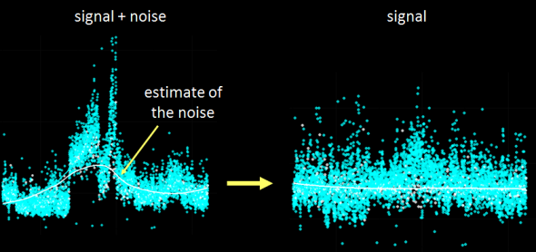
Recently I was tasked with evaluating and most importantly removing analytical variance form a longitudinal metabolomic analysis carried out over a few years and including >2,5000 measurements for >5,000 patients. Even using state-of-the-art analytical instruments and techniques long term biological studies are plagued with unwanted trends which are unrelated to the original experimental design and stem from analytical sources of variance (added noise by the process of measurement). Below is an example of a metabolomic measurement with and without analytical variance.

normalization


The noise pattern can be estimated based on replicated measurements of quality control samples embedded at a ratio of 1:10 within the larger experimental design. The process of data normalization is used to remove analytical noise from biological signal on a variable specific basis. At the bottom of this post, you can find an in-depth presentation of how data quality can be estimated and a comparison of many common data normalization approaches. From my analysis I concluded that a relatively simple LOESS normalization is a very powerful method for removal of analytical variance. While LOESS (or LOWESS), locally weighted scatterplot smoothing, is a relatively simple approach to implement; great care has to be taken when optimizing each variable-specific model.

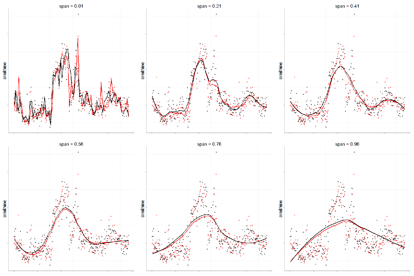
In particular, the span parameter or alpha controls the degree of smoothing and is a major determinant if the model  (calculated from repeated measures) is underfit, just right or overfit with regards to correcting analytical noise in samples. Below is a visualization of the effect of the span parameter on the model fit.

LOESS_span


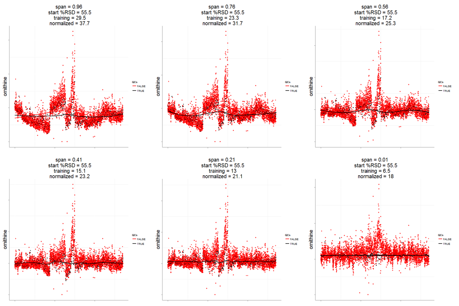
One method to estimate the appropriate span parameter is to use cross-validation with quality control samples. Having identified an appropriate span, a LOESS model can be generated from repeated measures data (black points) and is used to remove the analytical noise from all samples (red points).

loess_norm50

Having done this we can now evaluate the effect of removing analytical noise from quality control samples (QCs, training data, black points above) and samples (test data, red points) by calculating the relative standard deviation of the measured variable (standard deviation/mean *100). In the case of the single analyte, ornithine, we can see (above) that the LOESS normalization will reduce the overall analytical noise to a large degree. However we can not expect that the performance for the training data (noise only) will converge with that of the test set, which contains both noise and true biological signal.

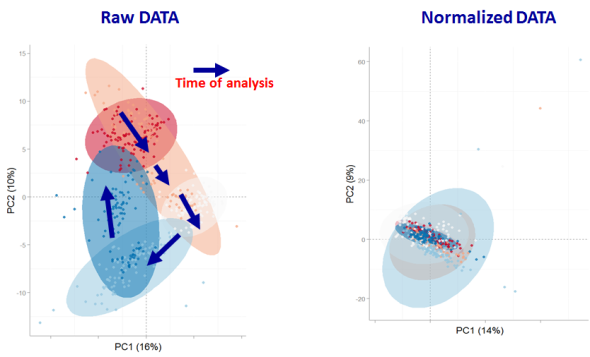
In addition to evaluating the normalization specific removal of analytical noise on a univariate level we can also use principal components analysis (PCA) to evaluate this for all variables simultaneously. Below is an example of the PCA scores for non-normalized and LOESS normalized data.

PCA normalizations


We can clearly see that the two largest modes of variance in the raw data explain differences in when the samples were analyzed, which is termed batch effects. Batch effects can mask true biological variability, and one goal of normalizations is to remove them, which we can see is accomplished in the LOESS normalized data (above right).


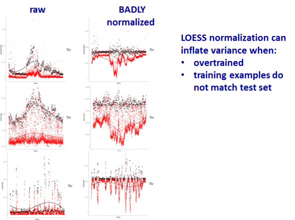
However be forewarned, proper model validation is critical to avoiding over-fitting and producing complete nonsense.

bad norm

In case you are interested the full analysis and presentation can be found below as well as the majority of the R code used for the analysis and visualizations.

Creative Commons License

To leave a comment for the author, please follow the link and comment on his blog: Creative Data Solutions » r-bloggers.

R-bloggers.com offers daily e-mail updates about R news and tutorials on topics such as: visualization (ggplot2, Boxplots, maps, animation), programming (RStudio, Sweave, LaTeX, SQL, Eclipse, git, hadoop, Web Scraping) statistics (regression, PCA, time series, trading) and more...
stone flakes

$
0
0

(This article was first published on Wiekvoet, and kindly contributed to R-bloggers)
I browsed through UC Irvine Machine Learning Repository! the other day and noticed a nice data set regarding stone flakes produced by our ancestors, the prehistoric men. To quote the dataset owners:
'The data set concerns the earliest history of mankind. Prehistoric men created the desired shape of a stone tool by striking on a raw stone, thus splitting off flakes, the waste products of the crafting process. Archaeologists do not find many tools, but they do find flakes. The data set is about these flakes.' The question attached to the data is: 'Does the data reflect the technological progress during several hundred thousand years?'. This blog post does not tackle that question but first examines the data as multivariate set.

Data

The data consists of two data sets; one set for flake properties, where rows do not stand for single flakes but for whole inventories of them. The annotation data are associated properties, such as age and hominid type. There are 79 records. As can be seen for the first records, there are some missing data.
r2 <- read.table('StoneFlakes.txt',header=TRUE,na.strings='?')
head(r2)
   ID  LBI  RTI  WDI FLA  PSF  FSF ZDF1 PROZD
1  ar   NA 35.3 2.60  NA 42.4 24.2 47.1    69
2 arn 1.23 27.0 3.59 122  0.0 40.0 40.0    30
3  be 1.24 26.5 2.90 121 16.0 20.7 29.7    72
4 bi1 1.07 29.1 3.10 114 44.0  2.6 26.3    68
5 bi2 1.08 43.7 2.40 105 32.6  5.8 10.7    42
6 bie 1.39 29.5 2.78 126 14.0  0.0 50.0    78
r1 <- read.table('annotation.txt',header=TRUE,na.strings='?')
head(r1)
   ID group  age dating mat region site number
1  ar     3 -120    geo   2      d    0     34
2 arn     2 -200   typo   1    mit    1      5
3  be     2 -200   typo   1    mit    1    331
4 bi1     1 -300    geo   1    mit    0   4111
5 bi2     1 -300    geo   2    mit    0     77
6 bie     2 -200    geo   1    mit    1      8

Density plots

To get an idea about the data I have made density plots. For compactness lattice plots are used. The reshape is just a preparation for that. From data perspective, the homo sapiens group is pretty small has a small data range.

r12 <- merge(r1,r2)
# density
cols <- colorRampPalette(c('violet','gold','seagreen'))(4) 
library(lattice)
long <- reshape(r12,direction='long',
    v.names='Response',
    varying=list(colnames(r2)[-1]),
    idvar=c('ID','group'),
    timevar='Variable',
    times=colnames(r2)[-1])
densityplot(~ Response | Variable ,groups= group,
    data=long ,scales=list(relation='free'),
    col=cols,
    auto.key=list(
        text=c('Lower Paleolithic, Homo ergaster?, oldest',
            'Levallois technique',
            'Middle Paleolithic, probably Neanderthals',
            'Homo Sapiens, youngest'),
        col=cols,
        lines=FALSE))

Biplot

A bipot is easily made. However, I am a bit of a fan of the biplots detailed in Gower and Hand's book. Since the heavy lifting for that is now in package calibrate they are easily made.
r12c <- r12[complete.cases(r12),]
pr1 <- princomp(~ LBI + RTI + WDI + FLA + PSF + FSF + ZDF1 + PROZD,
    r12c,
    cor=TRUE,
    scores=TRUE)
biplot(pr1,xlabs=r12c$ID)
Most of the following code is from calibrate's vignette. The colors in point labels are an annotation which I made. Unfortunately the textxy() function did not get color as I intended, so a for loop is made to get it correct. The length of the blue axis are made via trial and error. It should be noted that, similar to any biplot, there is some deformation, the axis are approximate.
library(calibrate)
X0<- subset(r12c,,c(LBI,RTI,WDI,FLA,PSF,FSF,ZDF1 ,PROZD))
X <- scale(X0)
rownames(X) <- r12c$ID
pca.results <- princomp(X,cor=FALSE)
Fp <- pca.results$scores
Gs <- pca.results$loadings
# no margins
par(mar=rep(0.05,4))
plot(Fp[,1],Fp[,2],
    pch=16,asp=1,
    xlim=c(-5,5),ylim=c(-5,5),
    frame.plot=TRUE,axes=FALSE,
    cex=0.5,type='n',
    col=cols[r12c$group])

for( ii in unique(r12c$group))
  textxy(Fp[r12c$group==ii,1],
      Fp[r12c$group==ii,2],
      rownames(X)[r12c$group==ii],
      cex=0.75,
      col=cols[ii],offset=0)

for (ii in 1:ncol(X)) {
  myseq <- seq(-2,2)
  if (colnames(X)[ii]=='LBI') myseq <-seq(-2,3)
  if (colnames(X)[ii] %in% c('RTI','FSF','PROZD')) myseq <-seq(-1.4,1.4)
  if (colnames(X)[ii]=='ZDF1') myseq <-seq(-1.5,2)
  ticklab <- pretty(myseq*attr(X,'scaled:scale')[ii]+attr(X,'scaled:center')[ii])
  
  ticklabc <- (ticklab-attr(X,'scaled:center')[ii])/attr(X,'scaled:scale')[ii]
  yc <- X[,ii]
  g <- Gs[ii,1:2]
  Calibrate.X3 <- calibrate(g,yc,ticklabc,Fp[,1:2],ticklab,tl=0.1,
      axislab=colnames(X)[ii],cex.axislab=0.75,where=1,labpos=4)
}

legend(x='topleft',
    legend=c('Lower Paleolithic, Homo ergaster?, oldest',
        'Levallois technique',
        'Middle Paleolithic, probably Neanderthals',
        'Homo Sapiens, youngest'),
    text.col=cols,
    ncol=1,cex=.75)

Hierarchical clustering

In the clustering it was chosen to use scaled data, just like the biplot. The reason is that the scales of the variables is quite different. The distance used is simple Euclidian, with average linkage. The code for colors in the dendrogam is not standard, but extracted from stackoverflow. 
ddi <- dist(X)
par(cex=.7)
hc <- hclust(ddi,method='average')

# adapted from http://stackoverflow.com/questions/18802519/label-and-color-leaf-dendrogram-in-r
labelCol <- function(x) {
  if (is.leaf(x)) {
    ## fetch label
    label <- attr(x, "label") 
    ## set label color to red for A and B, to blue otherwise
    attr(x, "nodePar") <- list(lab.col=cols[r12$group[r12$ID==label]],
        pch=46)
  }
  return(x)
}
## apply labelCol on all nodes of the dendrogram
dd <- dendrapply(as.dendrogram(hc,hang=.1), labelCol)

par(mar=c(3,.1,.1,2))
plot(dd,horiz=TRUE)

legend(x='topleft',
    legend=c('Lower Paleolithic, Homo ergaster?, oldest',
        'Levallois technique',
        'Middle Paleolithic, probably Neanderthals',
        'Homo Sapiens, youngest'),
    text.col=cols,
    ncol=1,cex=.75)

Interpretation

It would seem the data shows that the flakes shapes give a reasonable display of the groups, without using these groups as input information. This suggests that there is indeed a relation between flakes shape and time, which is for a future blog post.

To leave a comment for the author, please follow the link and comment on his blog: Wiekvoet.

R-bloggers.com offers daily e-mail updates about R news and tutorials on topics such as: visualization (ggplot2, Boxplots, maps, animation), programming (RStudio, Sweave, LaTeX, SQL, Eclipse, git, hadoop, Web Scraping) statistics (regression, PCA, time series, trading) and more...
PCA and K-means Clustering of Delta Aircraft

$
0
0

(This article was first published on everyday analytics, and kindly contributed to R-bloggers)

Introduction

I work in consulting. If you're a consultant at a certain type of company, agency, organization, consultancy, whatever, this can sometimes mean travelling a lot.

Many business travellers 'in the know' have heard the old joke that if you want to stay at any type of hotel anywhere in the world and get a great rate, all you have to do is say that you work for IBM.


The point is that my line of business requires travel, and sometimes that is a lot of the time, like say almost all of last year. Inevitable comparisons to George Clooney's character in Up in the Air were made (ironically I started to read that book, then left it on a plane in a seatback pocket), requests about favours involving duty free, and of course many observations and gently probing questions about frequent flier miles (FYI I've got more than most people, but a lot less than the entrepreneur I sat next to one time, who claimed to have close to 3 million).

But I digress.

Background

The point is that, as I said, I spent quite a bit of time travelling for work last year. Apparently the story with frequent fliers miles is that it's best just to pick one airline and stick with it - and this also worked out well as most companies, including my employer, have preferred airlines and so you often don't have much of a choice in the matter.

In my case this means flying Delta.

So I happened to notice in one of my many visits to Delta's website that they have data on all of their aircraft in a certain site section. I thought this would be an interesting data set on which to do some analysis, as it has both quantitative and qualitative information and is relatively complex. What can we say about the different aircraft in Delta's fleet, coming at it with 'fresh eyes'? Which planes are similar? Which are dissimilar?

Aircraft data card from Delta.com
The data set comprises 33 variables on 44 aircraft taken from Delta.com, including both quantitative measures on attributes like cruising speed, accommodation and range in miles, as well as categorical data on, say, whether a particular aircraft has Wi-Fi or video. These binary categorical variables were transformed into quantitative variables by assigning them values of either 1 or 0, for yes or no respectively.

Analysis

As this a data set of many variables (33) I thought this would be an interesting opportunity to practice using a dimensionality reduction method to make the information easier to visualize and analyze.

First let's just look at the intermediary quantitative variables related to the aircraft physical characteristics: cruising speed, total accommodation, and other quantities like length and wingspan. These variables are about in the middle of the data frame, so we can visualize all of them at once using a scatterplot matrix, which is the default for R's output if plot() is called on a dataframe.
data <- read.csv(file="delta.csv", header=T, sep=",", row.names=1)

# scatterplot matrix of intermediary (size/non-categorical) variables
plot(data[,16:22])

We can see that there are pretty strong positive correlations between all these variables, as all of them are related to the aircraft's overall size. Remarkably there is an almost perfectly linear relationship between wingspan and tail height, which perhaps is related to some principle of aeronautical engineering of which I am unaware.

The exception here is the variable right in the middle which is the number of engines. There is one lone outlier [Boeing 747-400 (74S)] which has four, while all the other aircraft have two. In this way the engines variable is really more like a categorical variable, but we shall as the analysis progresses that this is not really important, as there are other variables which more strongly discern the aircraft from one another than this.

How do we easier visualize a high-dimensional data set like this one? By using a dimensionality reduction technique like principal components analysis.

Principal Components Analysis

Next let's say I know nothing about dimensionality reduction techniques and just naively apply principle components to the data in R:
# Naively apply principal components analysis to raw data and plot
pc <- princomp(data)
plot(pc)
Taking that approach we can see that the first principal component has a standard deviation of around 2200 and accounts for over 99.8% of the variance in the data. Looking at the first column of loadings, we see that the first principle component is just the range in miles.

# First component dominates greatly. What are the loadings?
summary(pc) # 1 component has > 99% variance
loadings(pc) # Can see all variance is in the range in miles
Importance of components:
                             Comp.1       Comp.2       Comp.3       Comp.4
Standard deviation     2259.2372556 6.907940e+01 2.871764e+01 2.259929e+01
Proportion of Variance    0.9987016 9.337038e-04 1.613651e-04 9.993131e-05
Cumulative Proportion     0.9987016 9.996353e-01 9.997966e-01 9.998966e-01
            

                         Comp.1 Comp.2 Comp.3 Comp.4 Comp.5 Comp.6 Comp.7 Comp.8
Seat.Width..Club.                                    -0.144 -0.110              
Seat.Pitch..Club.                                    -0.327 -0.248         0.189
Seat..Club.                                                                     
Seat.Width..First.Class.                0.250        -0.160        -0.156  0.136
Seat.Pitch..First.Class.                0.515 -0.110 -0.386  0.112 -0.130  0.183
Seats..First.Class.                     0.258 -0.124 -0.307 -0.109  0.160  0.149
Seat.Width..Business.                  -0.154  0.142 -0.108                     
Seat.Pitch..Business.                  -0.514  0.446 -0.298  0.154 -0.172  0.379
Seats..Business.                       -0.225  0.187                            
Seat.Width..Eco.Comfort.                                     0.285 -0.224       
Seat.Pitch..Eco.Comfort.                0.159                0.544 -0.442       
Seats..Eco.Comfort.                                          0.200 -0.160       
Seat.Width..Economy.                                  0.125  0.110              
Seat.Pitch..Economy.                                  0.227  0.190        -0.130
Seats..Economy.                  0.597        -0.136  0.345 -0.165         0.168
Accommodation                    0.697               -0.104                0.233
Cruising.Speed..mph.                    0.463  0.809  0.289 -0.144  0.115       
Range..miles.             0.999                                                 
Engines                                                                         
Wingspan..ft.                    0.215         0.103 -0.316 -0.357 -0.466 -0.665
Tail.Height..ft.                                     -0.100        -0.187       
Length..ft.                      0.275         0.118 -0.318  0.467  0.582 -0.418
Wifi                                                                            
Video                                                                           
Power                                                                           
Satellite                                                                       
Flat.bed                                                                        
Sleeper                                                                         
Club                                                                            
First.Class                                                                     
Business                                                                        
Eco.Comfort                                                                     

Economy                                         

This is because the scale of the different variables in the data set is quite variable; we can see this by plotting the variance of the different columns in the data frame (regular scaling on the left, logarithmic on the right):
# verify by plotting variance of columns
mar <- par()$mar
par(mar=mar+c(0,5,0,0))
barplot(sapply(data, var), horiz=T, las=1, cex.names=0.8)
barplot(sapply(data, var), horiz=T, las=1, cex.names=0.8, log='x')
par(mar=mar)


We correct for this by scaling the data using the scale() function. We can then verify that the variances across the different variables are equal so that when we apply principal components one variable does not dominate.
# Scale
data2 <- data.frame(scale(data))
# Verify variance is uniform
plot(sapply(data2, var))
After applying the scale() function the variance is now constant across variables

Now we can apply principal components to the scaled data. Note that this can also be done automatically in call to the prcomp() function by setting the parameter scale=TRUE. Now we see a result which is more along the lines of something we would expect:
# Proceed with principal components
pc <- princomp(data2)
plot(pc)
plot(pc, type='l')
summary(pc) # 4 components is both 'elbow' and explains >85% variance


Great, so now we're in business. There are various rules of thumb for selecting the number of principal components to retain in an analysis of this type, two of which I've read about are:
  1. Pick the number of components which explain 85% or greater of the variation
  2. Use the 'elbow' method of the scree plot (on right)
Here we are fortunate in that these two are the same, so we will retain the first four principal components. We put these into new data frame and plot.
# Get principal component vectors using prcomp instead of princomp
pc <- prcomp(data2)

# First for principal components
comp <- data.frame(pc$x[,1:4])
# Plot
plot(comp, pch=16, col=rgb(0,0,0,0.5))

So what were are looking at here are twelve 2-D projections of data which are in a 4-D space. You can see there's a clear outlier in all the dimensions, as well as some bunching together in the different projections.

Normally, I am a staunch opponent of 3D visualization, as I've spoken strongly about previously. The one exception to this rule is when the visualization is interactive, which allows the user to explore the space and not lose meaning due to three dimensions being collapsed into a 2D image. Plus, in this particular case, it's a good excuse to use the very cool, very awesome rgl package.

Click on the images to view the interactive 3D versions (requires a modern browser). You can better see in the 3D projections that the data are confined mainly to the one plane one the left (components 1-3), with the exception of the outlier, and that there is also bunching in the other dimensions (components 1,3,4 on right).
library(rgl)
# Multi 3D plot
plot3d(comp$PC1, comp$PC2, comp$PC3)
plot3d(comp$PC1, comp$PC3, comp$PC4)
So, now that we've simplified the complex data set into a lower dimensional space we can visualize and work with, how do we find patterns in the data, in our case, the aircraft which are most similar? We can use a simple unsupervised machine learning technique like clustering.

Cluster Analysis

Here because I'm not a data scientist extraordinaire, I'll stick to the simplest technique and do a simple k-means - this is pretty straightforward to do in R.

First how do we determine the number of clusters? The simplest method is to look at the within groups sum of squares and pick the 'elbow' in the plot, similar to as with the scree plot we did for the PCA previously. Here I used the code from R in Action:
# Determine number of clusters
wss <- (nrow(mydata)-1)*sum(apply(mydata,2,var))
for (i in 2:15) wss[i] <- sum(kmeans(mydata,
centers=i)$withinss)
plot(1:15, wss, type="b", xlab="Number of Clusters",
ylab="Within groups sum of squares")

However, it should be noted that it is very important to set the nstart parameter and iter.max parameter (I've found 25 and 1000, respectively to be okay values to use), which the example in Quick-R fails to do, otherwise you can get very different results each time you run the algorithm, as below.

Clustering without the nstart parameter can lead to variable results for each run
Clustering with the nstart and iter.max parameters leads to consistent results, allowing proper interpretation of the scree plot
So here we can see that the "elbow" in the scree plot is at k=4, so we apply the k-means clustering function with k = 4 and plot.
# From scree plot elbow occurs at k = 4
# Apply k-means with k=4
k <- kmeans(comp, 4, nstart=25, iter.max=1000)
library(RColorBrewer)
library(scales)
palette(alpha(brewer.pal(9,'Set1'), 0.5))
plot(comp, col=k$clust, pch=16)


We can see that the one outlier is in its own cluster, there's 3 or 4 in the other and the remainder are split into two clusters of greater size. We visualize in 3D below, as before (click for interactive versions):
# 3D plot
plot3d(comp$PC1, comp$PC2, comp$PC3, col=k$clust)
plot3d(comp$PC1, comp$PC3, comp$PC4, col=k$clust)


We look at the exact clusters below, in order of increasing size:
# Cluster sizes
sort(table(k$clust))
clust <- names(sort(table(k$clust)))

# First cluster
row.names(data[k$clust==clust[1],])
# Second Cluster
row.names(data[k$clust==clust[2],])
# Third Cluster
row.names(data[k$clust==clust[3],])
# Fourth Cluster
row.names(data[k$clust==clust[4],])

[1] "Airbus A319 VIP"

[1] "CRJ 100/200 Pinnacle/SkyWest" "CRJ 100/200 ExpressJet"    
[3] "E120"                         "ERJ-145"                  

 [1] "Airbus A330-200"          "Airbus A330-200 (3L2)"
 [3] "Airbus A330-200 (3L3)"    "Airbus A330-300"      
 [5] "Boeing 747-400 (74S)"     "Boeing 757-200 (75E)"  
 [7] "Boeing 757-200 (75X)"     "Boeing 767-300 (76G)"  
 [9] "Boeing 767-300 (76L)"     "Boeing 767-300 (76T)"  
[11] "Boeing 767-300 (76Z V.1)" "Boeing 767-300 (76Z V.2)"
[13] "Boeing 767-400 (76D)"     "Boeing 777-200ER"      
[15] "Boeing 777-200LR"      

 [1] "Airbus A319"            "Airbus A320"            "Airbus A320 32-R"    
 [4] "Boeing 717"             "Boeing 737-700 (73W)"   "Boeing 737-800 (738)"
 [7] "Boeing 737-800 (73H)"   "Boeing 737-900ER (739)" "Boeing 757-200 (75A)"
[10] "Boeing 757-200 (75M)"   "Boeing 757-200 (75N)"   "Boeing 757-200 (757)"
[13] "Boeing 757-200 (75V)"   "Boeing 757-300"         "Boeing 767-300 (76P)"
[16] "Boeing 767-300 (76Q)"   "Boeing 767-300 (76U)"   "CRJ 700"            
[19] "CRJ 900"                "E170"                   "E175"                
[22] "MD-88"                  "MD-90"                  "MD-DC9-50"  

The first cluster contains a single aircraft, the Airbus A319 VIP. This plane is on its own and rightly so - it is not part of Delta's regular fleet but one of Airbus' corporate jets. This is a plane for people with money, for private charter. It includes "club seats" around tables for working (or not). Below is a picture of the inside of the A319 VIP:


Ahhh, that's the way fly (some day, some day...). This is apparently the plane professional sports teams and the American military often charter to fly - this article in the Sydney Morning Herald has more details.

The second cluster contains four aircraft - the two CRJ 100/200's and the Embraer E120 and ERJ-145. These are the smallest passenger aircraft, with the smallest accommodations - 28 for the E120 and 50 for the remaining craft. As such, there is only economy seating in these planes which is what distinguishes them from the remainder of the fleet. The E120 also has the distinction of being the only plane in the fleet with turboprops. Photos below.

Top: CRJ100/200. Bottom left: Embraer E120. Bottom right: Embraer ERJ-145.

I've flown many times in the venerable CRJ 100/200 series planes, in which I can assure you there is only economy seating, and which I like to affectionately refer to as "little metal tubes of suffering."

The other two clusters comprise the remainder of the fleet, the planes with which most commercial air travellers are familiar - your Boeing 7-whatever-7's and other Airbus and McDonnell-Douglas planes.

These are split into two clusters, which seem to again divide the planes approximately by size (both physical and accommodation), though there is crossover in the Boeing craft.
# Compare accommodation by cluster in boxplot
boxplot(data$Accommodation ~ k$cluster,
xlab='Cluster', ylab='Accommodation',
main='Plane Accommodation by Cluster')

# Compare presence of seat classes in largest clusters
data[k$clust==clust[3],30:33]
data[k$clust==clust[4],30:33]

First.Class Business Eco.Comfort Economy
Airbus A330-200 0 1 1 1
Airbus A330-200 (3L2) 0 1 1 1
Airbus A330-200 (3L3) 0 1 1 1
Airbus A330-300 0 1 1 1
Boeing 747-400 (74S) 0 1 1 1
Boeing 757-200 (75E) 0 1 1 1
Boeing 757-200 (75X) 0 1 1 1
Boeing 767-300 (76G) 0 1 1 1
Boeing 767-300 (76L) 0 1 1 1
Boeing 767-300 (76T) 0 1 1 1
Boeing 767-300 (76Z V.1) 0 1 1 1
Boeing 767-300 (76Z V.2) 0 1 1 1
Boeing 767-400 (76D) 0 1 1 1
Boeing 777-200ER 0 1 1 1
Boeing 777-200LR 0 1 1 1
First.Class Business Eco.Comfort Economy
Airbus A319 1 0 1 1
Airbus A320 1 0 1 1
Airbus A320 32-R 1 0 1 1
Boeing 717 1 0 1 1
Boeing 737-700 (73W) 1 0 1 1
Boeing 737-800 (738) 1 0 1 1
Boeing 737-800 (73H) 1 0 1 1
Boeing 737-900ER (739) 1 0 1 1
Boeing 757-200 (75A) 1 0 1 1
Boeing 757-200 (75M) 1 0 1 1
Boeing 757-200 (75N) 1 0 1 1
Boeing 757-200 (757) 1 0 1 1
Boeing 757-200 (75V) 1 0 1 1
Boeing 757-300 1 0 1 1
Boeing 767-300 (76P) 1 0 1 1
Boeing 767-300 (76Q) 1 0 1 1
Boeing 767-300 (76U) 0 1 1 1
CRJ 700 1 0 1 1
CRJ 900 1 0 1 1
E170 1 0 1 1
E175 1 0 1 1
MD-88 1 0 1 1
MD-90 1 0 1 1
MD-DC9-50 1 0 1 1


Looking at the raw data, the difference I can ascertain between the largest two clusters is that all the aircraft in the one have first class seating, whereas all the planes in the other have business class instead [the one exception being the Boeing 767-300 (76U)].

Conclusions

This was a little analysis which for me not only allowed me to explore my interest in commercial aircraft, but was also educational about finer points of what to look out for when using more advanced data science techniques like principal components, clustering and advanced visualization.

All in all, the techniques did a pretty admirable job in separating out the different type of aircraft into distinct categories. However I believe the way I structured the data may have biased it towards categorizing the aircraft by seating class, as that quality was replicated in the data set compared to other variables, being represented both in quantitative variables (seat pitch & width, number of seat in class) and categorical (class presence). So really the different seating classes where represented in triplicate within the data set compared to other variables, which is why the methods separated the aircraft in this way.

If I did this again, I would structure the data differently and see what relationships such analysis could draw out using only select parts of the data (e.g. aircraft measurements only). The interesting lesson here is that it when using techniques like dimensionality reduction and clustering it is not only important to be mindful of applying them correctly, but also what variables are in your data set and how they are represented.

For now I'll just keep on flying, collecting the miles, and counting down the days until I finally get that seat in first class.


References & Resources

Delta Fleet at Delta.com

Principal Components Analysis (Wikipedia):
http://en.wikipedia.org/wiki/Principal_components_analysis

The Little Book of R for Multivariate Analysis

Quick R: Cluster Analysis

Plane Luxury: how US sports stars fly (Syndney Morning Herald)

To leave a comment for the author, please follow the link and comment on his blog: everyday analytics.

R-bloggers.com offers daily e-mail updates about R news and tutorials on topics such as: visualization (ggplot2, Boxplots, maps, animation), programming (RStudio, Sweave, LaTeX, SQL, Eclipse, git, hadoop, Web Scraping) statistics (regression, PCA, time series, trading) and more...
Bedtools tutorial from 2013 CSHL course

$
0
0

(This article was first published on Getting Genetics Done, and kindly contributed to R-bloggers)
A couple of months ago I posted about how to visualize exome coverage with bedtools and R. But if you're looking to get a basic handle on genome arithmetic, take a look at Aaron Quinlan's bedtools tutorials from the 2013 CSHL course. The tutorial uses data from the Maurano et al exploration of DnaseI hypersensitivity sites in hundreds of primary tissue types (Science 337:1190-1195).

The tutorial provides examples with pictures and code to do things like:

Intersections to find features that overlap (or do NOT overlap):


Merging features like {ChIP,MEDIP,DNAse,*}-seq peaks:


Examining coverage:


Advanced usage using the Jaccard statistic to measure similarity of all 20 tissue types to all other 20 20 tissues, and visualizing this with principal components analysis and ggplot2 in R:


See the full bedtools documentation for more.

2013 CSHL bedtools tutorial: http://quinlanlab.org/tutorials/cshl2013/bedtools.html

To leave a comment for the author, please follow the link and comment on his blog: Getting Genetics Done.

R-bloggers.com offers daily e-mail updates about R news and tutorials on topics such as: visualization (ggplot2, Boxplots, maps, animation), programming (RStudio, Sweave, LaTeX, SQL, Eclipse, git, hadoop, Web Scraping) statistics (regression, PCA, time series, trading) and more...

Tailoring univariate probability distributions

$
0
0

(This article was first published on Are you cereal? » R, and kindly contributed to R-bloggers)

This post shows how to build a custom univariate distribution in R from scratch, so that you end up with the essential functions: a probability density function, cumulative distribution function, quantile function and random number generator.

In the beginning all you need is an equation of the probability density function, from which everyting else can be derived sometimes analytically, and always numerically. The analytical solutions may require some math skills, or may be impossible to find, but the numerical solutions are always feasible, require no math literacy, and coding them in R is easy with the uniroot() and integrate() functions.

Throughout the post I will use a simple exponential distribution as an example.

Probability density function (PDF)

You will need to know what probability density (or mass) function is, and what is the difference between probability density and probability. I found the best intro to be this Khan's video (10 min). Here is a couple of additional points:

  • Probability density is relative probability.
  • Probability density function evelauated for a given data point is the point's likelihood.
  • Probability density can be greater than one.

Example: Exponential PDF

The formula for the exponential probability density function (PDF) is:

 p(x) = \lambda e ^ {-\lambda x}, \qquad x \in [0, \infty]

In literature, small  p usually denotes probability density, while capital  P is used for probability.

We can code it in R:

  my.dexp <- function(x, lambda) lambda*exp(-lambda*x)
  my.dexp(x=0:5, lambda=2)
## [1] 2.0000000 0.2706706 0.0366313 0.0049575 0.0006709 0.0000908

And compare it with R's native PDF (it uses rate instead of  \lambda ):

  dexp(x=0:5, rate=2)
## [1] 2.0000000 0.2706706 0.0366313 0.0049575 0.0006709 0.0000908

Here is a plot of my PDF using the R's built-in function curve():

  curve(my.dexp(x, lambda=2), from=0, to=2, main="Exponential PDF")

plot of chunk unnamed-chunk-3

Cumulative distribution function (CDF) - analytical solution

This function gives, for a given point  x , the area under the PDF curve all the way down to the left of the point  x . This area is the probability that an outcome  X will have value lower or equal to  x :

 P(X \le x) = \int_0^x \! f(\pi \rightarrow X) \, \mathrm{d}\pi

I liked this stepbil's video (9 min) that shows how to flip between PDF and CDF, and why do we need the  \pi in the integral. I am really lame with calculus and what really works for me is Sage – it is free, it finds analytical solutions of integrals, and it may be worth a shot before diving into numerical integration.

For the exponential distribution the CDF is:

 P(X \le x) = 1 - e ^ {- \lambda x}, \qquad x \in [0, \infty]

In R it is:

  my.pexp.anal <- function(x, lambda) 1- exp(-lambda*x)
  my.pexp.anal(x=0:5, lambda=2)
## [1] 0.0000 0.8647 0.9817 0.9975 0.9997 1.0000

Cumulative distribution function (CDF) - numerical solution

For most practical purposes, numerical solutions of one- or two- dimensional problems seem to be as good as the analytical solutions, the only disadvantage is the computational demands. Here I used the R's native function integrate() to calculate the exponential CDF numerically:

  my.pexp.numerical <- function(x, lambda)
  {
    # this my.int function allows my CDF to run over vectors
    my.int <- function(x, lambda) integrate(my.dexp, lambda=lambda, lower=0, upper=x)$value
    # apply the my.int to each element of x
    sapply(x, FUN=my.int, lambda)
  }
  my.pexp.numerical(x=0:5, lambda=2)
## [1] 0.0000 0.8647 0.9817 0.9975 0.9997 1.0000

And let's plot the numerical solution over the analytical one:

  curve(my.pexp.anal(x, lambda=2), from=0, to=2, 
        col="green", main="exponential CDF")
  curve(my.pexp.numerical(x, lambda=2), from=0, to=2, 
        lty=2, col="red", add=TRUE)
  legend("bottomright", lty=c(1,2), 
         legend=c("Analytical", "Numerical"),        
         col=c("green", "red"), lwd=2)

plot of chunk unnamed-chunk-6

Practically identical.

Quantile function (QF) - analytical solution

Quantile functions are useful for two things: (1) assessing statistical significance, and (2) generating random numbers (see below). Quantile function ( P^- ) is the inverse of the cumulative distribution function. It means that you have to find a value of  x for a given  P(x) , which is an inverse action to what we usually do with functions. Finding an analytical solution may be quite tricky, and again, if you don't have a mathematician at your service, Sage can help.

In case of our exponential distribution, the quantile function is:

 P^{-}(q) = \frac{-\ln(1-q)}{\lambda}, \qquad q \in [0,1)

In R:

  my.qexp.anal <- function(q, lambda) (-log(1-q))/lambda 
  my.qexp.anal(0.9, 2)
## [1] 1.151

Quantile function (QF) - numerical solution

The inverse may be hard to get for many CDFs, and hence one may need to go for a numerical solution. I found that the easiest way to solve for inverse of univariate CDFs in R is the uniroot() function. Alternatives are optimize() or optim(), but they can be unstable. In contrast, uniroot() is simple, quick, and stable.

Here is my numerical solution for the expoentnial QF:

  my.qexp.numerical <- function(q, lambda)
  { 
    # function to be solved for 0
    f <- function(P, fixed)
    {
      lambda <- fixed$lambda
      q <- fixed$q
      # this is the criterion to be minimized by uniroot():
      criterion <- q - my.pexp.numerical(P, lambda)
      return(criterion)
    }

    # for each element of vector P (the quantiles)
    P <- numeric(length(q))
    for(i in 1:length(q))
    {
      # parameters that stay fixed
      fixed <- list(lambda=lambda, q=q[i])
      # solving the f for 0 numerically by uniroot():
      root.p <- uniroot(f, 
                        lower=0, 
                        upper=100, # may require adjustment
                        fixed=fixed)
      P[i] <-root.p$root
    }
    return(P)
  }

my.qexp.numerical(0.9, 2)
## [1] 1.151

Let's plot the numerical solution over the analytical one:

  q <- seq(0.01, 0.9, by=0.01)
  plot(q, my.qexp.anal(q, lambda=2), type="l", col="green", lwd=2)
  lines(q, my.qexp.numerical(q, lambda=2), col="red", lty=2)
  legend("bottomright", lty=c(1,2), 
         legend=c("Analytical", "Numerical"),        
         col=c("green", "red"), lwd=2)

plot of chunk unnamed-chunk-9

Random number generator - the inverse transform sampling

Have you ever wondered how R generates random draws from its distributions? How does it convert uniformly distributed pseudo-random numbers to, e.g., normally distributed numbers? For some time I naively thought that there are some giant built-in tables that R uses. Then I found that it's really simple.

The easiest way is the inverse transform sampling. It works like this: you generate a random number from  Uniform(0,1) and plug it into your quantile function (see above). That's it, and that's also why quantile functions can be really useful. Here is how you do it in R with the exponential distribution:

  my.rexp.inverse <- function(N, lambda)
  {
    U <- runif(N, min=0, max=1)
    rnd.draws <- my.qexp.anal(U, lambda)
    return(rnd.draws)
  }
  my.rexp.inverse(10, 2)
##  [1] 0.10087 0.56874 0.79258 0.01962 1.28166 0.39451 2.17646 0.48650
##  [9] 0.97453 0.33054

Here is a histogram of 10,000 random numbers generated by the inverse transform sampling. The solid smooth line is the exponential PDF from which the random numbers were drawn:

  hist(my.rexp.inverse(10000,2), freq=FALSE, breaks=20,
       xlab="x", main=NULL, col="grey")
  #hist(rexp(10000, rate=2), freq=FALSE, breaks=20)
  curve(dexp(x, rate=2), add=TRUE)

plot of chunk unnamed-chunk-11

Random number generator - rejection sampling

The advantage of rejection sampling is that you don't need the quantile function.
Notable texts on rejection sampling are provided by Jay Emerson, on Quantitations blog and on tsperry's blog. I will try to provide my own description and notation, which will hopefully complement the other posts.

In short, wou will need: (1) the so-called proposal probability densidy function which I will call  f(x) , (2) the PDF from which you want to sample, here called  p(x) , and (3) a constant  m which will satisfy  f(x) \times m > p(x) . In other words, the curve  f(x) \times m must lay entirely above the  p(x) curve, and ideally as close to  p(x) as possible (you will waste less samples). The  f(x) can be any PDF from which you are able to sample.

For my exponential example I will use simple uniform proposal density  f(x) . The following figure illustrates my exponential  p(x) , my proposal  f(x) , and  f(x) \times m :

  x <- seq(0, 5, by=0.01)
  # my exponential PDF:
  p <- dexp(x, rate=2)
  # my PROPOSAL distribution:
  f <- dunif(x, min=0, max=5) # my proposal is uniform and hence
                              # I need to choose an arbitrary upper bound 5
  # the CONSTANT m
  m <- 11
  fm <- f*m

  plot(c(0,5), c(0,2.5), type="n", xlab="x", ylab="density")
  lines(x, fm, type="l", col="red")
  lines(x, f, col="red", lty=2)
  lines(x, p)

  legend("right", lty=c(1,2,1), 
         legend=c("f(x)*m", "f(x)", "p(x)"), 
         col=c("red", "red", "black"), lwd=2)

plot of chunk unnamed-chunk-12

My uniform propsal distribution is not optimal – it will lead to high rejection rate and will require a lot of unnecessary computations. The uniform proposal will also truncate my samples at the max value of the uniform distribution. However, the uniform will still be ok for the illustration purposes here.

In rejection sampling the algorithm of one sampling step is:

  • 1. Sample a point  r_x from  f(x) .
  • 2. Draw a vertical line from  r_x all the way up to  m \times f(x) .
  • 3. Sample a point  r_v from a uniform density along the vertical line.
  • 4. If  r_v \leq p(x) accept the sample, otherwise go to 1.

This step is repeated until the desired number of accepted samples is reached.

Here is my rejection sampler for the exponential PDF:

  my.rexp.reject <- function(N, lambda, max)
  {
    samples <- numeric(N)
    m <- 12
    fxm <- dunif(0, 0, max)*m
    for (i in 1:N) 
    {
      repeat
      {
      # 1. sample from the propsal distribution:
        rx <- runif(1, 0, max)
      # 2. sample a point along a vertical line 
      #    at the rx point from Uniform(0, f(x)*m):
        rv <- runif(1, 0, fxm)
      # 3. evaluate the density of p(x) at rx
        dx <- dexp(rx, lambda)
      # 4. compare and accept if appropriate
        if (rv <= dx) 
        {
          samples[i] <- rx
          break        
        }
      }
    }
    return(samples)
  }

This is how 10,000 samples look like, together with the original PDF superimposed:

  x <- my.rexp.reject(N=10000, lambda=2, max=4)
  hist(x, freq=FALSE, breaks=30, col="gray", main=NULL)
  curve(dexp(x, 2), add=T)

plot of chunk unnamed-chunk-14

To leave a comment for the author, please follow the link and comment on his blog: Are you cereal? » R.

R-bloggers.com offers daily e-mail updates about R news and tutorials on topics such as: visualization (ggplot2, Boxplots, maps, animation), programming (RStudio, Sweave, LaTeX, SQL, Eclipse, git, hadoop, Web Scraping) statistics (regression, PCA, time series, trading) and more...

Multivariate Data Analysis and Visualization Through Network Mapping

$
0
0

(This article was first published on Creative Data Solutions » r-bloggers, and kindly contributed to R-bloggers)


Recently I had the pleasure of speaking about one of my favorite topics, Network Mapping. This is a continuation of a general theme I’ve previously discussed and involves the merger of statistical and multivariate data analysis results with a network.


Over the past year I’ve been working on two major tools, DeviumWeb and MetaMapR, which aid the process of biological data (metabolomic) network mapping.

deviuWeb

DeviumWeb- is a shiny based GUI written in R which is useful for:

  • data manipulation, transformation and visualization
  • statistical analysis (hypothesis testing, FDR, power analysis, correlations, etc)
  • clustering (heiarchical, TODO: k-means, SOM, distribution)
  • principal components analysis (PCA)
  • orthogonal partial least squares multivariate modeling (O-/PLS/-DA)

 
MetaMapR

MetaMapR- is also a shiny based GUI written in R which is useful for calculation and visualization of various networks including:

  • biochemical
  • structural similarity
  • mass spectral similarity
  • correlation


Both of theses projects are under development, and my ultimate goal is to design a one-stop-shop ecosystem for network mapping.


In addition to network mapping,the video above and presentation below also discuss normalization schemes for longitudinal data and genomic, proteomic and metabolomic functional analysis both on a pathway and global level.


As always happy network mapping!

Creative Commons License

To leave a comment for the author, please follow the link and comment on his blog: Creative Data Solutions » r-bloggers.

R-bloggers.com offers daily e-mail updates about R news and tutorials on topics such as: visualization (ggplot2, Boxplots, maps, animation), programming (RStudio, Sweave, LaTeX, SQL, Eclipse, git, hadoop, Web Scraping) statistics (regression, PCA, time series, trading) and more...

stone flakes IV

$
0
0

(This article was first published on Wiekvoet, and kindly contributed to R-bloggers)
In this post I want to try something new, a causal graphical model. The aim here is just as much to get myself a feel what these things do as to understand how the stone flakes data fit together.

Data

Data are stone flakes data which I analyzed previously. The first post was clustering, second linking to hominid type, third regression. Together these made for the bulk of a standard analysis. In this new analysis the same starting data is used.
r2 <- read.table('StoneFlakes.txt',header=TRUE,na.strings='?')
r1 <- read.table('annotation.txt',header=TRUE,na.strings='?')
r12 <- merge(r1,r2)

Packages

The main package used is pcalg (Methods for graphical models and causal inference). Even though it lives on cran, it requires RBGL (An interface to the BOOST graph library) which lives on Bioconductor. Plots are made via Rgraphvis (Provides plotting capabilities for R graph objects), Bioconductor again, which itself has the hard work done by graphviz, which, on my linux machine, is a few clicks to install. 
library('pcalg')
library('Rgraphviz')


First analysis

I am just following the vignette here, to get some working code.
rx <- subset(r12,,names(r2)[-1])
rx <- rx[complete.cases(rx) & !(r12$ID %in% c('ms','c','roe','sz','va','arn')),]
suffStat <- list(C = cor(rx), n = nrow(rx))
pc.gmG <- pc(suffStat, indepTest = gaussCItest,
    p = ncol(rx), alpha = 0.01)
png('graph1.png')
plot(pc.gmG, main = "")


personally I dislike this plot since you have to know which variable is which number. I don't think that is acceptable for things one wants to share. Since I could not find documentation how to modify this via the plot statement, I took the ugly road of directly modifying an S4 object; pc.Gmc.
pc.gmG@graph@nodes <- names(rx)
names(pc.gmG@graph@edgeL) <- names(rx)
png('graph2.png')
plot(pc.gmG, main = "")
dev.off()

This makes some sense looking at the variable names.
RTI (Relative-thickness index of the striking platform) is connected to WDI (Width-depth index of the striking platform). PSF (platform primery (yes/no, relative frequency)) is related to FSF (Platform facetted (yes/no, relative frequency)). PSF is also related to PROZD (Proportion of worked dorsal surface (continuous)) which then goes to ZDF1 (Dorsal surface totally worked (yes/no, relative frequency)). ZDF1 is also influenced by FLA (Flaking angle (the angle between the striking platform and the splitting surface)).

Second analysis

Much as like this analysis, it does not lead to a connection between flakes on one hand and age or group on the other hand. Since the algorithm assumes normal distributed variables, group is out of the question. Log(-age) seems to be closest to normal distributed.
rx <- subset(r12,,names(r2)[-1])
rx$lmage <- log(-r12$age)
rx <- rx[complete.cases(rx) & !(r12$ID %in% c('ms','c','roe','sz','va','arn')),]
suffStat <- list(C = cor(rx), n = nrow(rx))
pc.gmG <- pc(suffStat, indepTest = gaussCItest,
    p = ncol(rx), alpha = 0.01)
pc.gmG@graph@nodes <- names(rx)
names(pc.gmG@graph@edgeL) <- names(rx)
plot(pc.gmG, main = "")


Adding age links the two parts, while keeping most of the previous graph unchanged. The causal link however, seems reversed, does age cause change in flakes or do changes in flakes cause age? Nevertheless, it does show a different picture than before. In linear regression FSF and LBI contributed, but there I had not removed the outliers. In this approach FSF features, but is in its turn driven by PSF. The other direct influence is ZDF1, which is now also driven by WDI.

Third analysis

It is probably pushing the limits of what is normal distributed, but there are two binairy variables, stone material (1=flint, 2=other) and site (1=gravel pit, 0=other).
rx <- subset(r12,,c('site','mat',names(r2)[-1]))
rx$lmage <- log(-r12$age)
rx <- rx[complete.cases(rx) & !(r12$ID %in% c('ms','c','roe','sz','va','arn')),]
suffStat <- list(C = cor(rx), n = nrow(rx))
pc.gmG <- pc(suffStat, indepTest = gaussCItest,
    p = ncol(rx), alpha = 0.01)
pc.gmG@graph@nodes <- names(rx)
names(pc.gmG@graph@edgeL) <- names(rx)
plot(pc.gmG, main = "")

This makes a link from material to RTI (relative thickness) and a connection site to FLA (flaking angle), see below.
# site (1=gravel pit, 0=other)
boxplot(FLA ~ c('other','gravel pit')[site+1],
    data=r12,
    ylab='FLA',
    xlab='site')

#stone material (1=flint, 2=other)
boxplot(RTI ~ c('flint','other')[mat],
    data=r12,
    ylab='RTI',
    xlab='mat')

To leave a comment for the author, please follow the link and comment on his blog: Wiekvoet.

R-bloggers.com offers daily e-mail updates about R news and tutorials on topics such as: visualization (ggplot2, Boxplots, maps, animation), programming (RStudio, Sweave, LaTeX, SQL, Eclipse, git, hadoop, Web Scraping) statistics (regression, PCA, time series, trading) and more...

Using Biplots to Map Cluster Solutions

$
0
0

(This article was first published on Engaging Market Research, and kindly contributed to R-bloggers)
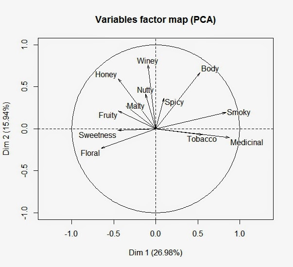
FactoMineR is a quick and easy R package for generating biplots, such as the following plot showing the columns as arrows with the rows to be added later as points. As you might recall from a previous post, a biplot maps a data matrix by plotting both the rows and columns in the same figure. Here the columns (variables) are arrows and the rows (individuals) will be points. By default, FactoMineR avoids cluttered maps by separating the variables and individuals factor maps into two plots. The variables factor map appears below, and the individuals factor map will be shown later in this post.
The dataset comes from David Wishart's book Whiskey Classified, Choosing Single Malts by Flavor. Some 86 whiskies from different regions of Scotland were rated on 12 aromas and flavors from "not present" (a rating of 0) to "pronounced" (a rating of 4). Luba Gloukhov ran a cluster analysis with this data and plotted the location where each whisky was distilled on a map of Scotland. The dataset can be retrieved as a csv file using the R function read.csv("clipboard'). All you need to do is go to the web site, select and copy the header and the data, and run the R function read.csv pointing to the clipboard. All the R code is presented at the end of this post.

Each arrow in the above plot represents one of the 12 ratings. FactoMineR takes the 86 x 12 matrix and performs a principal component analysis. The first principal component is labeled as Dim 1 and accounts for almost 27% of the total variation. Dim 2 is the second principal component with an additional 16% of the variation. One can read the component loadings for any rating by noting the perpendicular projection of the arrow head onto each dimension. Thus, Medicinal and Smoky have high loadings on the first principal component with Sweetness, Floral and Fruity anchoring the negative end. One could continue in the same manner with the second principal component, however, at some point we might notice the semi-circle that runs from Floral, Sweetness and Fruity through Nutty, Winey and Spicy to Smoky, Tobacco and Medicinal. That is, the features sweep out a one-dimensional arc, not unlike a multidimensional scaling of color perceptions (see Figure 1).
Now, we will add the 86 points representing the different whiskies. But first we will run a cluster analysis so that when we plot the whiskies, different colors will indicate cluster membership. I have included the R code to run both a finite mixture model using the R package mclust and a k-means. Both procedures yield four-cluster solutions that classify over 90% of the whiskies into the same clusters. Luba Gloukhov also extracted four clusters by looking for an "elbow" in the plot of the within-cluster sum-of-squares from two through nine clusters. By default, Mclust will test one through nine clusters and select the best model using the BIC as the selection criteria. The cluster profiles from mclust are presented below.

Black Red Green Blue Total
27 36 6 17 86
31% 42% 7% 20% 100%
Body 2.7 1.4 3.7 1.9 2.1
Sweetness 2.4 2.5 1.5 2.1 2.3
Smoky 1.5 1.0 3.7 1.9 1.5
Medicinal 0.0 0.2 3.3 1.0 0.5
Tobacco 0.0 0.0 0.7 0.3 0.1
Honey 1.9 1.1 0.2 1.0 1.3
Spicy 1.6 1.1 1.7 1.6 1.4
Winey 1.9 0.5 0.5 0.8 1.0
Nutty 1.9 1.3 1.2 1.4 1.5
Malty 2.1 1.7 1.3 1.7 1.8
Fruity 2.1 1.9 1.2 1.3 1.8
Floral 1.6 2.1 0.2 1.4 1.7

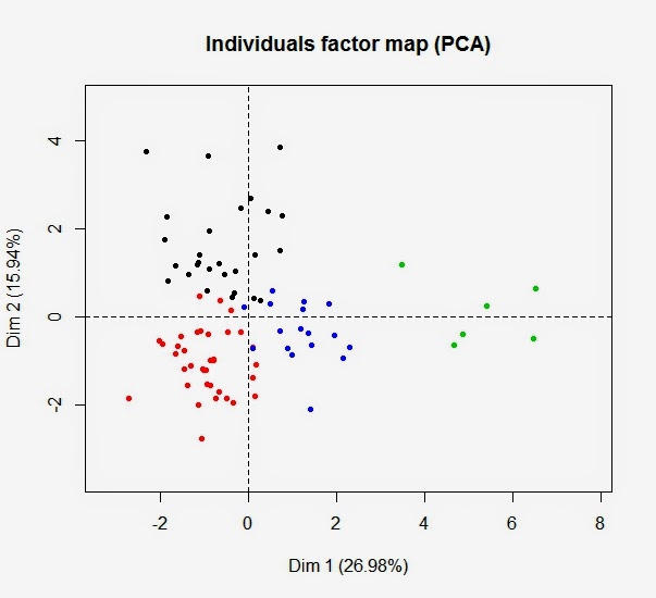
Finally, we are ready to look at the biplot with the rows represented as points and the color of each point indicating cluster membership, as shown below in what FactoMineR calls the individuals factor map. To begin, we can see clear separation by color suggesting that differences among the cluster reside in the first two dimensions of this biplot. It is important to remember that the cluster analysis does not use the principal component scores. There is no data reduction prior to the clustering.
The Green cluster contains only 6 whiskies and falls toward the right of the biplot. This is the same direction as the arrows for Medicinal, Tobacco and Smoky. Moreover, the Green cluster received the highest scores on these features. Although the arrow for Body does not point in that direction, you should be able to see that the perpendicular projection of the Green points will be higher than that for any other cluster. The arrow for Body is pointed upward because a second and larger cluster, the Black, also receives a relatively high rating. This is not the case for other three ratings. Green is the only cluster with high ratings on Smoky or Medicinal. Similarly, though none of the whiskies score high on Tobacco, the six Green whiskies do get the highest ratings.

You can test your ability to interpret biplots by asking on what features the Red cluster should score the highest. Look back up to the vector map, and identify the arrows pointing in the same direction as the Red cluster or pointing in a direction so that the Red points will project toward the high end of the arrow. Do you see at least Floral and Sweetness? The process continues in the same manner for the Black cluster, but the Blue cluster, like its points, fall in the middle without any distinguishing features.

Hopefully, you have not been troubled by my relaxed and anthropomorphic writing style. Vectors do not reposition themselves so that all the whiskies earning high scores will project themselves toward its high end, and points do not move around looking for that one location that best reproduces all their ratings. However, principal component analysis does use a singular value decomposition to factor data matrices into row and column components that reproduce the original data as closely as possible. Thus, there is some justification for such talk. Nevertheless, it helps with the interpretation to let these vectors and points come alive and have their own intentions.

What Did We Do and Why Did We Do It?

We began trying to understand a cluster analysis derived from a data matrix containing the ratings for 86 whiskies across 12 aroma and taste features. Although not a large data matrix, one still has some difficulty uncovering any underlying structure by looking one variable/column at a time. The biplot helps by creating a low-dimensional graphic display with ratings as vectors and whiskies as points. The ratings appeared to be arrayed along an arc from floral to medicinal, and the 86 whiskies were located as points in this same space.

Now, we are ready to project the cluster solution onto this biplot. By using separate ratings, the finite mixture model worked in the 12-dimensional rating space and not in the two-dimensional world of the biplot. Yet, we see relatively coherent clusters occupying different regions of the map. In fact, except for the Blue cluster falling in the middle, the clusters move along the arc from a Red floral to a Black malty/honey/nutty/winey to a Green medicinal. The relationships among the four clusters are revealed by their color coding on the biplot. They are no longer four qualitatively distinct entries, but a continuum of locally adjacent groupings arrayed along a nonlinear dimension from floral to medicinal.

R code needed to run all the analysis in this post.

# read data from external site
# after copied into the clipboard
data <- read.csv("clipboard")
ratings<-data[,3:14]
 
# runs finite mixture model
library(mclust)
fmm<-Mclust(ratings)
fmm
table(fmm$classification)
fmm$parameters$mean
 
# compares with k-means solution
kcl<-kmeans(ratings, 4, nstart=25)
table(fmm$classification, kcl$cluster)
 
# creates biplots
library(FactoMineR)
pca<-PCA(ratings)
plot(pca, choix=c("ind"), label="none", col.ind=fmm$classification)

Created by Pretty R at inside-R.org

To leave a comment for the author, please follow the link and comment on his blog: Engaging Market Research.

R-bloggers.com offers daily e-mail updates about R news and tutorials on topics such as: visualization (ggplot2, Boxplots, maps, animation), programming (RStudio, Sweave, LaTeX, SQL, Eclipse, git, hadoop, Web Scraping) statistics (regression, PCA, time series, trading) and more...

Stone Flakes V, networks again

$
0
0

(This article was first published on Wiekvoet, and kindly contributed to R-bloggers)
Last week I tried pcalg. This week deal (Learning Bayesian Networks with Mixed Variables). The aim n this post I want to try something new, a causal graphical model. The aim here is just as much to get myself a feel what these things do as to understand how the stone flakes data fit together.

Data

Data are stone flakes data which I analyzed previously. The first post was clustering, second linking to hominid type, third regression. Together these made for the bulk of a standard analysis. In this new analysis the same starting data is used.
r2 <- read.table('StoneFlakes.txt',header=TRUE,na.strings='?')
r1 <- read.table('annotation.txt',header=TRUE,na.strings='?')
r12 <- merge(r1,r2) 

r12$group <- factor(r12$group,labels=c('Lower Paleolithic',
        'Levallois technique',
        'Middle Paleolithic',
        'Homo Sapiens'))
r12$site <- factor(c('other','gravel pit')[r12$site+1])
r12$mat <- factor(c('flint','other')[r12$mat])
r12$lmage <- log10(-r12$age)

Deal

The starting point of this post was to continue/ my analysis of last week. But when I discovered deal could be used to discover the model, repeating last week's analysis was chosen instead. Deal does not have a Vignette, but there is a paper
deal: A Package for Learning Bayesian Networks which helped me very well to get started.

First Model

Initially I wanted to start with a model containing only continuous variables, similar to before, but that threw an error in jointprior(). Hence I added groups as factor. Autosearch() and heuristicsearch() give a lot of output, basically one line for each step. For brievety these are not shown. The good thing about this model is that it has a solution where 'group' is driving other variables.
library(deal)
rfin <- subset(r12,,c(names(r2)[-1],'group'))
rfin <- rfin[complete.cases(rfin),]
rfin.nw <- network(rfin)
rfin.prior <- jointprior(rfin.nw)

Imaginary sample size: 8 
rfin.nw <- learn(rfin.nw,rfin,rfin.prior)$nw
rfin.search <- autosearch(rfin.nw,
    rfin,
    rfin.prior,
    trace=FALSE)

plot(rfin.search$nw)
Heuristic is used to further improve the model. In the end the model seems a bit more complex that pcalg, but not unreasonably so.
rfin.heuristic <- heuristic(rfin.search$nw,
    rfin,
    rfin.prior,
    restart=10,
    trace=FALSE,
    trylist=rfin.search$trylist)
plot(rfin.heuristic$nw)

Second model

For brevity I won't be repeating the code. It is all the same except for the data going in, which will be shown. The second model is similar to the first, but the (potential) outliers have been removed. This model looks even more clean.
rfin <- subset(r12,
    !(r12$ID %in% c('ms','c','roe','sz','va','arn')),
    c(names(r2)[-1],'group'))
rfin <- rfin[complete.cases(rfin),]

Third model

Including all sensible factors is the model I wanted to do. However, it seemed the imaginary sample size grew to 96. It is my experience that higher imaginary sample sizes produce more complex networks and longer run times. The current model seems a bit too complex to my liking. Moving under the recommended number gave runtime errors. 

Final model

In the final model (a few are skipped now) a number of simplifications were made. Region is removed as factor, log(-age) as continuous variable. Group has lost Homo Sapiens, since that category had only three records. The model is restricted in the sense that group cannot be the result of other variables. In the plot these are shown as red arrows.
rfin <- subset(r12,
    !(r12$ID %in% c('ms','c','roe','sz','va','arn')),
    c(-ID,-number,-age,-dating,-region,-lmage))
rfin <- rfin[rfin$group !='Homo Sapiens',]
rfin <- rfin[complete.cases(rfin),]
rfin.nw <- network(rfin)
rfin.prior <- jointprior(rfin.nw)
mybanlist <- matrix(
    c(2:11,
        rep(1,10)),ncol=2)
banlist(rfin.nw) <- mybanlist

Conclusion

Deal makes too complex networks for my liking, pcalg cannot use discrete variables. Deal has banned links, a feature which helps. pcalg made more nice plots, but I have the feeling that is relatively easily remedied. Neither gave a model which struck me as a model to continue with. I'll be needing quite some more study to feel comfortable with this kind of models.

To leave a comment for the author, please follow the link and comment on his blog: Wiekvoet.

R-bloggers.com offers daily e-mail updates about R news and tutorials on topics such as: visualization (ggplot2, Boxplots, maps, animation), programming (RStudio, Sweave, LaTeX, SQL, Eclipse, git, hadoop, Web Scraping) statistics (regression, PCA, time series, trading) and more...

Introduction to R for Life Scientists: Course Materials

$
0
0

(This article was first published on Getting Genetics Done, and kindly contributed to R-bloggers)
Last week I taught a three-hour introduction to R workshop for life scientists at UVA's Health Sciences Library.


I broke the workshop into three sections:

In the first half hour or so I presented slides giving an overview of R and why R is so awesome. During this session I emphasized reproducible research and gave a demonstration of using knitr + rmarkdown in RStudio to produce a PDF that can easily be recompiled when data updates.

In the second (longest) section, participants had their laptops out with RStudio open coding along with me as I gave an introduction to R data types, functions, getting help, data frames, subsetting, and plotting. Participants were challenged with an exercise requiring them to create a scatter plot using a subset of the built-in mtcars dataset.

We concluded with an analysis of RNA-seq data using the DESeq2 package. We started with a count matrix and a metadata file (the modENCODE pasilla knockout data packaged with DESeq2), imported the data into a DESeqDataSet object, ran the DESeq pipeline, extracted results, and did some basic visualization (MA-plots, PCA, volcano plots, etc). A future day-long course will cover RNA-seq in more detail (intro UNIX, alignment, & quantitation in the morning; intro R, QC, and differential expression analysis in the afternoon).

I wrote the course materials using knitr, rendered using Jekyll, hosted as a GitHub project page. The rendered course materials can be found at the link below, and the source is on GitHub.

Course Materials: Introduction to R for Life Scientists

Slides:


Cheat Sheet:


To leave a comment for the author, please follow the link and comment on his blog: Getting Genetics Done.

R-bloggers.com offers daily e-mail updates about R news and tutorials on topics such as: visualization (ggplot2, Boxplots, maps, animation), programming (RStudio, Sweave, LaTeX, SQL, Eclipse, git, hadoop, Web Scraping) statistics (regression, PCA, time series, trading) and more...

Advanced R Profiling with pbdPAPI

$
0
0

(This article was first published on librestats » R, and kindly contributed to R-bloggers)

R has some extremely useful utilities for profiling, such as system.time(), Rprof(), the often overlooked tracemem(), and the rbenchmark package. But if you want more than just simple timings of code execution, you will mostly have to look elsewhere.

One of the best sources for profiling data is hardware performance counters, available in most modern hardware. This data can be invaluable to understanding what a program is really doing. The Performance Application Programming Interface (PAPI) library is a well-known profiling library, and allows users to easily access this profiling data. So we decided to bring PAPI to R. It's available now in the package pbdPAPI, and is supported in part as a 2014 Google Summer of Code project (thanks Googs!).

So what can you do with it? I'll show you.


How Many Numerical Operations does a PCA Need?

Flops, or "floating point operations per second" is an important measurement of performance of some kinds of programs. A very famous benchmark known as the LINPACK benchmark is a measurement of the flops of a system solving a system of linear equations using an LU decomposition with partial pivoting. You can see current and historical data for supercomputer performance on the LINPACK Benchmark, or even see how your computer stacks up with the biggest computers in the world at Top 500.

For an example, let's turn to the pbdPAPI package's Principal Components Analysis demo. This demo measures the number of floating point operations (things like addition, subtraction, multiplication, and division) executed by your compter to perform a PCA, and compares it against the number of operations theoretically required to compute a PCA. This theoretical value is determined by evaluating the different compute kernels that make up a PCA. For an mxn matrix with PCA computed via SVD of the data matrix (as in R's prcomp()), we need:

  • 2mn + 1 operations to center the data.
  • 6mn^2 + 20n^3 operations for the SVD.
  • 2mn^2 operations for the projection onto the right singular vectors (the retx=TRUE part).

We only add the count for centering (and not scaling), because that's the R default (for some reason...). For more details, see Golub and Van Loan's "Matrix Computations".

An example output from running the demo on this machine is:

      m  n  measured theoretical difference pct.error   mflops
1 10000 50 212563800   203500001    9063799  4.264037 2243.717

So pbdPAPI measured 212.6 million floating point operations, while the theoretical number is 203.5 million. That difference is actually quite small, and seems fairly reasonable. Also note that we clock in at around 2.2 Gflops (double precision). And we achieve all of this with a simple system.flops() call from pbdPAPI:

library(pbdPAPI)

m <- 10000
n <- 50
x <- matrix(rnorm(m*n), m, n)

flops <- system.flops(prcomp(x, center=FALSE, scale.=FALSE))


Mathematically Equivalent, but Computationally Different Operations

Another interesting thing you can do with pbdPAPI is easily measure cache misses. Remember when some old grumpy jerk told you that "R matrices are column-major"? Or that, when operating on matrices, you should loop over columns first, then rows? Why is that? Short answer: computers are bad at abstraction. Long answer: cache.

If you're not entirely familiar with CPU caches, I would encourage you to take a gander at our spiffy vignette. But the quick summary is that lots of cache misses is bad. To understand why, you might want to take a look at this interactive visualization of memory access speeds.

To show off how this works, we're going to measure the cache misses of a simple operation: allocate a matrix and set all entries to 1. We're going to use Rcpp to do this, mostly because measuring the performance of for loops in R is too depressing.

First, let's do this by looping over rows and then columns. Said another way, we fix a row and and fill all of its entries with 1 before moving to the next row:

SEXP rows_first(SEXP n)
{
  int i, j;
  const int n = INTEGER(n_)[0];
  Rcpp::NumericMatrix x(n, n);

  for (i=0; i<n; i++)
    for (j=0; j<n; j++)
      x(i, j) = 1.;

  return x;
}

Next, we'll loop over columns first, then rows. Here we fix a column and fill each row's entry in that column with 1 before proceeding:

SEXP cols_first(SEXP n)
{
  int i, j;
  const int n = INTEGER(n_)[0];
  Rcpp::NumericMatrix x(n, n);

  for (j=0; j<n; j++)
    for (i=0; i<n; i++)
      x(i, j) = 1.;

  return x;
}

Assuming these have been compiled for use with R, say with the first as bad() and the second as good(), we can easily measure the cache misses like so:

library(pbdPAPI)

n <- 10000L

system.cache(bad(n))
system.cache(good(n))

Again using this machine as a reference we get:

$`Level 1 cache misses`
[1] 202536304

$`Level 2 cache misses`
[1] 168382934

$`Level 3 cache misses`
[1] 21552970

for bad(), and:

$`Level 1 cache misses`
[1] 15771212

$`Level 2 cache misses`
[1] 1889270

$`Level 3 cache misses`
[1] 1286338

for good().  Just staring at these huge values may not be easy on the eyes, so here's a plot showing this same information:

cache misses

Here, lower is better, and so the clear winner is, as the name implies, good(). Another valuable measurement is the ratio of total cache misses (data and instruction) to total cache accesses.  Again, with pbdPAPI, measuring this is trivial:

system.cache(bad(n), events="l2.ratio")
system.cache(good(n), events="l2.ratio")

On this machine, we see:

L2 cache miss ratio 
          0.8346856 
L2 cache miss ratio 
           0.112331 

Here too, lower is better, and so we again see a clear winner. The full source for this example is available here.


Wrapup

pbdPAPI can measure much, much more than just flops and cache misses. See the package vignette for more information about what you can measure with pbdPAPI. The package is available now on GitHub and is permissively licensed under the BSD 2-clause license, and it will come to CRAN eventually.

Ok now the downside; at the moment, it doesn't work on Windows or Mac.

We have spent the last month working on extending support to Windows and/or Mac, but it's not entirely trivial for a variety of reasons, as PAPI itself only supports Linux and FreeBSD at this time. We are committed to platform independence, and I believe we'll get there soon, in some capacity. But for now, it works fantastically on your friendly neighborhood Linux cluster.

Finally, a quick thanks again to the Googs, and also thanks to the folks who run the R organization for Google Summer of Code, especially Brian. And thanks to our student, who I think is doing a great job so far.

To leave a comment for the author, please follow the link and comment on his blog: librestats » R.

R-bloggers.com offers daily e-mail updates about R news and tutorials on topics such as: visualization (ggplot2, Boxplots, maps, animation), programming (RStudio, Sweave, LaTeX, SQL, Eclipse, git, hadoop, Web Scraping) statistics (regression, PCA, time series, trading) and more...

Things to try after useR! – Part 1: Deep Learning with H2O

$
0
0

(This article was first published on Blend it like a Bayesian!, and kindly contributed to R-bloggers)


Annual R User Conference 2014

The useR! 2014 conference was a mind-blowing experience. Hundreds of R enthusiasts and the beautiful UCLA campus, I am really glad that I had the chance to attend! The only problem is that, after a few days of non-stop R talks, I was (and still am) completely overwhelmed with the new cool packages and ideas.

Let me start with H2O - one of the three promising projects that John Chambers highlighted during his keynote (the other two were Rcpp/Rcpp11 and RLLVM/RLLVMCompile).

What's H2O?

"The Open Source In-Memory, Prediction Engine for Big Data Science" - that's what Oxdata, the creator of H2O, said. Joseph Rickert's blog post is a very good introduction of H2O so please read that if you want to find out more. I am going straight into the deep learning part.

Deep Learning in R

Deep learning tools in R are still relatively rare at the moment when compared to other popular algorithms like Random Forest and Support Vector Machines. A nice article about deep learning can be found here. Before the discovery of H2O, my deep learning coding experience was mostly in Matlab with the DeepLearnToolbox. Recently, I have started using 'deepnet', 'darch' as well as my own code for deep learning in R. I have even started developing a new package called 'deepr' to further streamline the procedures. Now I have discovered the package 'h2o', I may well shift the design focus of 'deepr' to further integration with H2O instead!

But first, let's play with the 'h2o' package and get familiar with it.

The H2O Experiment

The main purpose of this experiment is to get myself familiar with the 'h2o' package. There are quite a few machine learning algorithms that come with H2O (such as Random Forest and GBM). But I am only interested in the Deep Learning part and the H2O cluster configuration right now. So the following experiment was set up to investigate:
  1. How to set up and connect to a local H2O cluster from R.
  2. How to train a deep neural networks model.
  3. How to use the model for predictions.
  4. Out-of-bag performance of non-regularized and regularized models.
  5. How does the memory usage vary over time.

Experiment 1: 

For the first experiment, I used the Wisconsin Breast Cancer Database. It is a very small dataset (699 samples of 10 features and 1 label) so that I could carry out multiple runs to see the variation in prediction performance. The main purpose is to investigate the impact of model regularization by tuning the 'Dropout' parameter in the h2o.deeplearning(...) function (or basically the objectives 1 to 4 mentioned above).

Experiment 2: 

The next thing to investigate is the memory usage (objective 5). For this purpose, I chose a bigger (but still small in today's standards) dataset MNIST Handwritten Digits Database (LeCun et al.). I would like to find out if the memory usage can be capped at a defined allowance over long period of model training process.

    Findings

    OK, enough for the background and experiment setup. Instead of writing this blog post like a boring lab report, let's go through what I have found out so far. (If you want to find out more, all code is available here so you can modify it and try it out on your clusters.)

    Setting Up and Connecting to a H2O Cluster

    Smoooooth! - if I have to explain it in one word. Oxdata made this really easy for R users. Below is the code to start a local cluster with 1GB or 2GB memory allowance. However, if you want to start the local cluster from terminal (which is also useful if you see the messages during model training), you can do this java -Xmx1g -jar h2o.jar (see the original H2O documentation here).

    By default, H2O starts a cluster using all available threads (8 in my case). The h2o.init(...) function has no argument for limiting the number of threads yet (well, sometimes you do want to leave one thread idle for other important tasks like Facebook). But it is not really a problem.

    Loading Data

    In order to train models with the H2O engine, I need to link the datasets to the H2O cluster first. There are many ways to do it. In this case, I linked a data frame (Breast Cancer) and imported CSVs (MNIST) using the following code.


    Training a Deep Neural Network Model

    The syntax is very similar to other machine learning algorithms in R. The key differences are the inputs for x and y which you need to use the column numbers as identifiers.


    Using the Model for Prediction

    Again, the code should look very familiar to R users.


    The h2o.predict(...) function will return the predicted label with the probabilities of all possible outcomes (or numeric outputs for regression problems) - very useful if you want to train more models and build an ensemble.

    Out-of-Bag Performance (Breast Cancer Dataset)


    No surprise here. As I expected, the non-regularized model overfitted the training set and performed poorly on test set. Also as expected, the regularized models did give consistent out-of-bag performance. Of course, more tests on different datasets are needed. But this is definitely a good start for using deep learning techniques in R!

    Memory Usage (MNIST Dataset)


    This is awesome and really encouraging! In near idle mode, my laptop uses about 1GB of memory (Ubuntu 14.04). During the MNIST model training, H2O successfully kept the memory usage below the capped 2GB allowance over time with all 8 threads working like a steam train! OK, this is based on just one simple test but I already feel comfortable and confident to move on and use H2O for much bigger datasets.

    Conclusions

    OK, let's start from the only negative point. The machine learning algorithms are limited to the ones that come with H2O. I cannot leverage the power of other available algorithms in R yet (correct me if I am wrong. I will be very happy to be proven wrong this time. Please leave a comment on this blog so everyone can see it). Therefore, in terms of model choices, it is not as handy as caret and subsemble.

    Having said that, the included algorithms (Deep Neural Networks, Random Forest, GBM, K-Means, PCA etc) are solid for most of the common data mining tasks. Discovering and experimenting with the deep learning functions in H2O really made me happy. With the superb memory management and the full integration with multi-node big data platforms, I am sure this H2O engine will become more and more popular among data scientists. I am already thinking about the  Parallella project but I will leave it until I finish my thesis.

    I can now understand why John Chambers recommended H2O. It has already become one of my essential R tools for data mining. The deep learning algorithm in H2O is very interesting, I will continue to explore and experiment with the rest of the regularization parameters such as 'L1', 'L2' and 'Maxout'.

    Code

    As usual, code is available at my GitHub repo for this blog.

    Personal Highlight of useR! 2014

    Just a bit more on useR! During the conference week, I met so many cool R people for the very first time. You can see some of the photos by searching #user2014 and my twitter handle together. Other blog posts about the conference can be found here, herehere, herehere and here. For me, the highlight has to be this text analysis by Ajay:
    ... which means I successfully made Matlab trending with R!!! 

    During the conference banquet, Jeremy Achin (from DataRobot) suggested that I might as well change my profile photo to a Python logo just to make it even more confusing! It was also very nice to speak to Matt Dowle in person and to learn about his amazing data.table journey from S to R. I have started updating some of my old code to use data.table for the heavy data wrangling tasks.

    By the way, Jeremy and the DataRobot team (a dream team of top Kaggle data scientists including Xavier who gave a talk about "10 packages to Win Kaggle Competitions") showed me an amazing demo of their product. Do ask them for a beta account and see for yourself!!!

    There are more cool things that I am trying at the moment. I will try to blog about them in the near future. If I have to name a few right now ... that will be:

    (Pheeew! So here is my first blog post related to machine learning - the very purpose of starting this blog. Not bad it finally happened after a whole year!)

    To leave a comment for the author, please follow the link and comment on his blog: Blend it like a Bayesian!.

    R-bloggers.com offers daily e-mail updates about R news and tutorials on topics such as: visualization (ggplot2, Boxplots, maps, animation), programming (RStudio, Sweave, LaTeX, SQL, Eclipse, git, hadoop, Web Scraping) statistics (regression, PCA, time series, trading) and more...

    Parameterized SQL queries

    $
    0
    0

    (This article was first published on SmarterPoland » PISA in english, and kindly contributed to R-bloggers)

    Mateusz Żółtak asked me to spread the word about his new R package for parameterized SQL queries. Below you can find the copy of package vignette. If you work with SQL in R you may find it useful.

    The package RODBCext is an extension of the RODBC database connectivity package. It provides support for parameterized queries. This document describes what parameterized queries are and when they should be used. In addition some examples of ROBDCext usage are shown.

    It is assumed that you already know the RODBC package and the basics of SQL and ODBC. If not, please read about them first, e.g. see the ODBC Connectivity vignette of the RODBC package.

    1 What are parameterized queries for?

    Parameterized queries (also known as prepared statements) are a technique of query execution which separates a query string from query parameters values. There are two main reasons for using this technique:

    • avoiding SQL injections,
    • speeding up query execution in some scenarios.

    Both are discussed below.

    2 SQL injections

    SQL injection is an attack against your code which uses SQL queries. Malicious query parameter values are passed in order to modify and execute a query. If you use SQL data sources, it is highly likely that sooner or later your R code will experience a problem similar to an SQL injection (or an SQL injection itself). Consider the following:

    • Even data from trusted data sources (even SQL ones) can cause problems in SQL queries if use improper programming techniques.
    • Are you sure that your data came from a really trusted source?
    • All Shiny applications which process data from SQL data sources can be a target of an SQL injection attack.

    2.1 Example – an apostrophe sign in data

    Let us begin with a simple example illustrating how your own data can lead to problems similar to a SQL injections attack.

    Imagine a simple SQL database with a table called cakes:

    cake price
    Chocolate cake 10
    Strawberry cupcake 3
    Kevin’s Cherry Tart 12.3

    We receive a CSV data file containing the same database but with new prices. You are asked to update the database. So you write your R code as below:

    library(RODBC)
    
    connHandle <- odbcConnect("cakesDatabase")
    newData <- read.csv("newData.csv", stringsAsFactors = F)
    
    for(row in 1:nrow(newData)){
      query <- paste0(
        "UPDATE cakes 
         SET price = ", newData$price[row], " 
         WHERE cake = '", newData$cake[row], "'"
      )
      sqlQuery(connHandle, query)
    }
    
    odbcClose(connHandle)

    Such a code will fail on a Kevin’s Cherry Tart because this name contains an apostrophe. The resulting query would be UPDATE cakes SET price = 12.3 WHERE cake = 'Kevin's Cherry Tart'; which is not a proper SQL query. To deal with the Kevin’s Cherry Tart we need to escape the apostrophe in the cake’s name so that the database knows that it doesn’t denote the end of the string value.

    2.2 Example – simple SQL injection

    There is a nice XKCD about that – see here. Let’s translate it into an example in R.

    We have got a database of students with a table students

    last_name first_name
    Smith John
    Lee Andrew
    Wilson Linda

    A new school year has begun and new students have come. We have just received a CSV file with the same structure as the table students and we are asked to add it to the database. So we prepare a simple script:

    library(RODBC)
    
    connHandle <- odbcConnect('studentsDatabase')
    newStudents <- read.csv('newStudents.csv', stringsAsFactors = F)
    
    for(row in 1:nrow(newStudents)){
      query <- paste0(
        "INSERT INTO students (first_name, last_name)
         VALUES (
           '", newStudents$first_name[row],"', 
           '", newStudents$last_name[row],"', 
         )"
      )
      sqlQuery(P, query)
    }
    
    odbcClose(connHandle)

    Unfortunately one of our new students’ name is:

    last_name first_name
    Smith Robert’); DROP TABLE students; –

    For this student our query would be:

    INSERT INTO students (last_name, first_name)
      VALUES ('Smith', 'Robert'); DROP TABLE students; --')

    These are in fact two SQL queries and one SQL comment:

    • INSERT INTO students (last_name, first_name) VALUES ('Smith', 'Robert');
    • DROP TABLE students;
    • --')

    Execution of such a query can lead to a serious data loss (hopefully we have made a backup copy or do not have sufficient rights to drop the students table). To avoid such problems we should properly escape parameters values in our SQL queries.

    2.3 How to escape values in SQL queries?

    At this point we already know that we should properly escape parameters values in our SQL queries. There are many techniques of doing that:

    • Manually checking the data types.
    • Using parameterized queries.
    • Using high-level functions which escape values for us.

    2.3.1 Manually checking data types

    You can escape your data manually, e.g.

    • cast numeric columns to numbers using as.numeric(column) or sprintf(“%d %f”, integerColumn, realColumn),
    • cast dates using as.character(as.Date(column)),
    • escape strings using gsub(“‘“,”’’”, column),
    • etc.

    This is possible but is also very error prone, especially when escaping string values. Everyone knows that apostrophes have to be escaped, but:

    • Different database systems may use different escape sequences (e.g. C-style with a backslash or repeat-style a with double apostrophe).
    • our database system may handle HTML/XML entities or inserting characters by a Unicode value (or many, many other strange ways of data input), so e.g. my’value or my\U0027value will be converted into my’value and then lead to errors in your query.

    It is almost impossible to remember all caveats by yourself, so it is strongly advised not to use this method.

    2.3.2 Using parameterized queries

    Another solution is to separate the query string from its parameters (data). In such case a query execution is divided into two steps:

    • query parsing and planing,
    • passing parameter values to query and query execution.

    As query parameters are passed separately, parameter values cannot modify (and break) the query string. To indicate places in the query where parameters will be placed, a special character is used, typically a question mark.

    Let us rewrite our cakes example using the sqlExecute(connHandle, queryString, data) function from the RODBCext package:

    library(RODBCext)
    
    connHandle <- odbcConnect("cakesDatabase")
    newData <- read.csv("newData.csv", stringsAsFactors = F)
    
    query <- "UPDATE cakes SET price = ? WHERE cake = ?"
    for(row in 1:nrow(newData)){
      sqlExecute(connHandle, query, newData[i, ])
    }
    
    odbcClose(connHandle)

    We replaced the parameter values in query with a question mark and passed query and data as separate function parameters. We made our code not only SQL injection resistant, but also easier to read.

    Moreover, the function function sqlExecute() supports vectorized data, so we can make it even simpler:

    library(RODBCext)
    
    connHandle <- odbcConnect("cakesDatabase")
    newData <- read.csv("newData.csv", stringsAsFactors = F)
    
    query <- "UPDATE cakes SET price = ? WHERE cake = ?"
    sqlExecute(connHandle, query, newData)
    
    odbcClose(connHandle)

    2.3.3 Using high-level functions which deal with escaping values for us

    This would be the most straightforward solution.

    An excellent example is dplyr, which provides a complete R to SQL mapper and allows us to completely forget about the SQL. Another example are the sqlSave(), sqlUpdate(), sqlCopy() and sqlCopyTable() functions from the RODBC package which deal with escaping values for us.

    The problem is that: * Dplyr escapes values rather naively. With respect to strings only simple ‘to’’ escaping is performed which is enough to prevent silly errors but will fail against more advanced SQL injections. * RODBC’s high-level functions escape values in a safe way (by internally using parameterized queries), but have very limited functionality. Interestingly, judging from the comments in the source code, the parameterized queries have been introduced to them not to make them safe but to improve speed.

    2.4 Summary

    When using SQL we must pay attention to escape query parameter values properly. The existing R database connectivity packages do not provide a completely reliable way of doing that. A set of SQL injections safe functions provides very limited functionality and more flexible functions are using naive escaping methods. That is why RODBCext is a preferred way to make your R code SQL injections safe.

    I hope dplyr developers will switch to use parameterized queries internally at some point. This would provide R community with a brilliant and safe R to SQL mapper and to forget about a manual preparation of SQL queries.

    3 Speeding up query execution using parameterized queries

    SQL query execution is being performed in a few steps. The first two steps are

    • Parsing the query string into internal database query data structures.
    • Planning the query, e.g. deciding the order of joining the tables, indexes which should be used to execute a query, etc.

    If we repeat the same query many times and only values of query parameters are changing, it will be faster to perform these steps only once and then reuse the already parsed and planed query. This can be achieved by using parameterized queries.

    3.1 Example – big insert

    A typical scenario is an insert of many rows to a table:

    library(RODBCext)
    connHandle <- odbcConnect('EWD') # my sample ODBC database
    data <- data.frame(1:10000, letters[rep(1:10, 1000)])
    
    # Ordinary query - paste0() called in every loop
    system.time({
      for(row in 1:nrow(data)){
        query <- paste0("INSERT INTO my_table VALUES (", data[row, 1], "'", data[row, 2],"')")
        sqlQuery(connHandle, query)
      }
    })
    #   user  system elapsed 
    #  5.384   2.288  16.397
    
    # Ordinary query - paste0() called only once
    system.time({
      queries <- paste0(
        "INSERT INTO my_table VALUES (", data[, 1], "'", data[, 2],"')"
      )
      for(query in queries){
        sqlQuery(connHandle, query)
      }
    })
    #   user  system elapsed 
    #  2.088   2.028   7.255 
    
    # Parameterized query
    system.time({
      sqlExecute(connHandle, "INSERT INTO my_table VALUES (?, ?)", data)
    })
    #   user  system elapsed 
    #  0.300   0.232   3.935 
    odbcClose(connHandle)

    3.2 Example – speeding up a SELECT query

    Also repeated execution of a SELECT query can benefit from using parameterized variant:

    library(RODBCext)
    connHandle <- odbcConnect('EWD') # my sample ODBC database
    
    pupils = sqlQuery(
      connHandle, "SELECT id_obserwacji FROM obserwacje LIMIT 10000", 
      stringsAsFactors = F
    )[, 1]
    
    # Ordinary query - paste0() called in every loop
    system.time({
      for(i in pupils){
        query <- paste0(
          "SELECT count(*) 
           FROM testy_obserwacje JOIN testy USING (id_testu) JOIN arkusze USING (arkusz) 
           WHERE id_obserwacji = ", pupils[i]
        )
        tmp <- sqlQuery(connHandle, query)
        # some other computations here
      }
    })
    #   user  system elapsed 
    # 10.896   1.508  61.424 
    
    # Ordinary query - paste0() called only once
    system.time({
      queries <- paste0(
        "SELECT count(*) 
         FROM testy_obserwacje JOIN testy USING (id_testu) JOIN arkusze USING (arkusz) 
         WHERE id_obserwacji = ", pupils
      )
      for(query in queries){
        tmp <- sqlQuery(connHandle, query)
        # some other computations here
      }
    })
    #   user  system elapsed 
    # 11.016   1.108  51.766 
    
    # Parameterized query
    system.time({
      query = "
        SELECT count(*) 
        FROM testy_obserwacje JOIN testy USING (id_testu) JOIN arkusze USING (arkusz) 
        WHERE id_obserwacji = ?"
      sqlPrepare(connHandle, query)
      for(i in pupils){
        tmp = sqlExecute(connHandle, NULL, pupils[i], fetch=T)
        # some other computations here
      }
    })
    #   user  system elapsed 
    # 12.140   0.312  26.468

    The longer query string, the more complicated query planning and the more query repetitions, the bigger amount of time can be saved.

    4 Parameterized SQL queries in R

    Unfortunately all known to me R packages providing support for SQL databases lacks support for parameterized queries. Even the R DBI interface doesn’t define any methods which would allow to implement parameterized queries. The main reason for that is probably that R packages developers used to see SQL databases as just another storage backend for data frames rather than powerful data processing engines (which modern SQL databases already are).

    4.1 RODBCext

    RODBCext package tries to fill this gap by introducing parameterized queries support on the top of the RODBC package. RODBCext provides only two functions, both of them using database connection handlers from RODBC:

    • sqlPrepare(connHandle, SQLquery, errors = TRUE)
    • sqlExecute(connHandle, SQLquery, data, fetch = FALSE, errors = TRUE, ...)

    4.1.1 sqlExecute()

    Allows execution of SQL queries separated from query parameters values, e.g.:

    library(RODBCext)
    connHandle <- odbcConnect("myDatabase")
    
    # good old RODBC call
    data <- sqlQuery(connHandle, "SELECT * FROM myTable WHERE column = 'myValue'") 
    # RODBCext equivalent
    data <- sqlExecute(connHandle, "SELECT * FROM myTable WHERE column = ?", 'myValue', fetch = TRUE) 
    
    odbcClose(connHandle)

    The nice thing is that sqlExecute() (in opposite to sqlQuery()) supports vectorization. In the example below data will contain results of all five queries bound by rows.

    library(RODBCext)
    connHandle <- odbcConnect("myDatabase")
    
    filterData <- data.frame('column1' = 1:5, column2 = c('a', 'b', 'c', 'd', 'e'))
    data <- sqlExecute(connHandle, "SELECT * FROM myTable WHERE column1 = ? AND column2 = ?", filterData, fetch = TRUE)
    
    odbcClose(connHandle)

    Results can be also fetched separately using RODBC’s sqlGetResults(). This also provides a way to fetch results in parts:

    library(RODBCext)
    connHandle <- odbcConnect("myDatabase")
    
    sqlExecute(connHandle, "SELECT * FROM myTable WHERE column = ?", 'myValue', fetch = FALSE)
    data <- sqlGetResults(connHandle, max = 10) # fetch no more than 10 first rows
    # data processing comes here
    data <- sqlGetResults(connHandle) # fetch all other rows
    
    odbcClose(connHandle)

    As sqlExecute() uses internally sqlGetResults() to fetch results of the query, it also accept all parameters of the sqlGetResults():

    library(RODBCext)
    connHandle <- odbcConnect("myDatabase")
    
    sqlExecute(
      connHandle, "SELECT * FROM myTable WHERE column = ?", 'myValue', 
      fetch = TRUE, stringsAsFactors = FALSE, dec = ",", max = 50, as.is = TRUE
    )
    
    odbcClose(connHandle)

    4.1.2 sqlPrepare()

    Parses a query string and plans a query. Query can be executed later using sqlExecute() with a parameter query set too NULL. This can provide some performance gain when executing the same query multiple times (see the chapter Speeding up query execution using parameterized queries). Usage example:

    library(RODBCext)
    connHandle <- odbcConnect('myDatabase') 
    
    sqlPrepare(connHandle, "SELECT * FROM myTable WHERE column = ?") # prepare query
    
    # for some reason (e.g. resources limits) data must be processed sequentialy
    foreach(i in observations){
      data = sqlExecute(connHandle, NULL, i$column, fetch=T)
      # data processing for a given observations goes here
    }
    odbcClose(connHandle)

    // add bootstrap table styles to pandoc tables $(document).ready(function () { $('tr.header').parent('thead').parent('table').addClass('table table-condensed'); });

    To leave a comment for the author, please follow the link and comment on his blog: SmarterPoland » PISA in english.

    R-bloggers.com offers daily e-mail updates about R news and tutorials on topics such as: visualization (ggplot2, Boxplots, maps, animation), programming (RStudio, Sweave, LaTeX, SQL, Eclipse, git, hadoop, Web Scraping) statistics (regression, PCA, time series, trading) and more...

    A Conversation with Max Kuhn – The useR! 2014 Interview

    $
    0
    0

    (This article was first published on DataScience.LA » R, and kindly contributed to R-bloggers)

    The Interview

    In the video above, Max provides some amazing insights into the why and how of caret, an R package he created. He also discusses his book on Applied Predictive Modeling which he co-authored with Kjell Johnson, including details on how he set out to write the book he wished he would have had. As a special bonus, Max also describes Quinlan’s C5.0, an alternate “forest of decision trees” algorithm, the secrets of which were hidden behind commercial licensing for years – and which has recently been ported and made available to the R ecosystem. Whether you are a beginner just getting your feet wet with R and predictive modeling, or a seasoned data scientist, this interview has something for everyone.

    Expanding Your Superpowers with Caret

    “What is your favorite superpower?” is a classic icebreaker, and the answers will tell you quite a lot about the people answering. Someone in the group will immediately claim that the ability to fly is paramount. Someone else invariably brings up invisibility. Super strength, super speed, laser vision, the ability to talk to sea creatures – these are all fine choices. For me, however, the best answer has always been the ability to predict the future. No other superpower seems to compare – if you can predict the future, then you know how a Flying Superhero will attack, and that you’ll need to bring a mirror to battle Laser-Vision Man. If you can predict the future, perhaps you’ll skip out on that whale watching adventure if you know Sea-Creatures Guy has it out for you. Considering the (current) impossibility of choosing one’s superpower, it’s a fun thought exercise but not much else.

    In the context of data science, however, there may be a little something to be done about this “predicting the future” thing, and maybe, just maybe, Max Kuhn is the guy to show you how to do it.

    A non-clinical statistician, is kind of exactly what it sounds like. – Max Kuhn

    Max is the Director of Nonclinical Statistics at Pfizer, a position that involves supporting a great many scientists with software tools, analysis, and machine learning during the creation and validation of molecules in the pipeline to become potentially life-saving and life-giving medicines. He is also the creator of the caret package for the R language. caret (short for Classification And REgression Training) is a set of functions which attempt to streamline the process of creating predictive models. Put succintly, the caret package provides the ‘train’ function. This function is your gateway to nearly every awesome machine learning model that can be implemented in R. Want to train a neural network to predict Species from all other variables in the iris data set?

    train(Species ~ ., data=iris, method="nnet”)

    Turns out that a neural network didn’t provide the accuracy you wanted and instead you decide to try out a more powerful machine learning technique, like random forests?

    train(Species ~ ., data=iris, method="rf")

    Perhaps you’re willing to trade a little bit of predictive power in exchange for interpretability, in which case you’d switch over to traditional decision trees.

    train(Species ~ ., data=iris, method="rpart")

    That’s all it takes to get started. That’s it.

    Inside of the train function, Max has taken his combined decades of experience and expertise creating predictive models and has hidden that complexity for the sake of usability. Each method has its own series of smart defaults and behavior, so that even if you only stick to the basics you can still hit the ground running and be productive. However, the caret package contains much, much more than just the train function.

    Inside of the package, Max has encoded best-practice approaches for handling those pitfalls that both new and experienced data scientists might face. Perennial questions such as ‘How do you handle unbalanced classes?’ are answered in caret, providing functions to create balanced data partitions. How do you approach feature selection? Caret is helpful and provides recursive feature elimination. How do you make sure that scaling/centering/PCA pre-processing are properly handled during your cross-validation steps and that they don’t add bias to your results? Caret has your back. How do you test your newly-trained model on a held-back training set and view the accuracy metrics? Caret has a a buffet of options waiting patiently at your fingertips. Suddenly, you can start to predict the future… and you’re certainly a little closer to having a superpower with caret in your toolbox.

    To leave a comment for the author, please follow the link and comment on his blog: DataScience.LA » R.

    R-bloggers.com offers daily e-mail updates about R news and tutorials on topics such as: visualization (ggplot2, Boxplots, maps, animation), programming (RStudio, Sweave, LaTeX, SQL, Eclipse, git, hadoop, Web Scraping) statistics (regression, PCA, time series, trading) and more...

    Extracting Latent Variables from Rating Scales: Factor Analysis vs. Nonnegative Matrix Factorization

    $
    0
    0

    (This article was first published on Engaging Market Research, and kindly contributed to R-bloggers)
    For many of us, factor analysis provides a gateway to learning how to run and interpret nonnegative matrix factorization (NMF). This post will analyze a set of ratings on a 218 item adjective checklist using both principal axis factor analysis and NMF. The entire analysis will be performed in R using less than two dozen lines of code located at the end of this post.

    The R package mokken contains a dataset called acl with 433 students who looked at 218 adjectives and told us whether the adjectives described themselves using a 5-point rating scale from 0=completely disagree to 4=completely agree. I borrowed this dataset because it has a sizable number of items so that it might pose a challenge for traditional factor analysis. There will be no discussion of the nonparametric item response modeling performed by the mokken package.

    Factor Analysis of the Adjective Checklist Ratings

    Although R offers many alternatives for running a factor analysis, you might wish to become familiar with the psych package including its extensive documentation and broad coverage of psychometrics. We will start the analysis by attempting to determine the number of factors to extract. The scree plot is presented below.

    There appears to be a steep drop for the first six components and then a leveling off. I tried 10 factors, but found that 9 factors yielded an interpretable factor structure. Technically, one might argue that we are not performing a factor analysis since we are not replacing the main diagonal of the correlation matrix with communality estimates. We call this a principal axis or just principal factor analysis for it consists of extracting and rotating principal components.

    I have shown only a portion of the factor loadings for the 218 items below. You can reproduce the analysis yourself by installing the mokken package and running the R code at the end of the post. The nine factors were named based on the factor loadings indicating the correlations between the observed adjective ratings and the latent variables. The names have been kept short, and you are free to change them as you deem appropriate. Naming is an art, yet be careful not to add surplus meaning by being overly creative. Several of the factors loadings are negative, for example, an open person is not self-centered or egotistical. The star next to the name indicates that the scaling has been reversed so that unfriendly* actually means friendly and hostile* is not hostile. This is how the dataset handles negatively worded items.
    Open
    Calm
    Creative
    Orderly
    Outgoing
    Friendly
    Smart
    Headstrong
    Pretty
    egotistical
    -0.63
    0.22
    illiberal*
    0.62
    0.13
    0.20
    0.10
    0.12
    hostile*
    0.61
    0.31
    0.24
    -0.11
    self-centered
    -0.60
    0.14
    0.15
    unfriendly*
    0.60
    0.29
    0.13
    tense*
    0.11
    0.74
    0.14
    relaxed
    0.68
    0.17
    0.16
    nervous
    -0.12
    -0.68
    -0.15
    0.10
    leisurely
    0.62
    0.21
    0.22
    0.11
    stable
    0.61
    0.10
    0.22
    -0.10
    0.19
    0.29
    anxious
    -0.19
    -0.61
    -0.18
    0.11
    resourceful
    0.68
    0.16
    0.14
    inventive
    0.64
    0.11
    0.15
    enterprising
    0.15
    0.64
    0.25
    0.23
    0.18
    initiative
    0.17
    0.60
    0.19
    0.23
    0.21
    0.13
    versatile
    0.60
    0.12
    0.11
    0.25
    0.14
    orderly
    0.77
    organized
    0.76
    planful
    0.16
    0.71
    -0.12
    0.12
    slipshod*
    0.70
    -0.11
    -0.11
    disorderly*
    0.13
    0.67
    withdrawn*
    0.24
    0.67
    0.10
    silent*
    0.18
    0.66
    0.18
    0.11
    shy*
    0.28
    0.13
    0.62
    inhibited*
    0.11
    0.27
    0.18
    0.62
    timid*
    0.17
    0.16
    0.61
    0.17
    friendly
    0.31
    0.11
    -0.16
    0.58
    0.16
    0.15
    sociable
    0.29
    0.18
    0.25
    0.57
    appreciative
    0.31
    0.20
    0.10
    0.53
    0.13
    cheerful
    0.38
    0.32
    0.11
    0.30
    0.51
    -0.11
    0.10
    jolly
    0.14
    0.27
    0.27
    0.49
    -0.11
    -0.14
    intelligent
    0.23
    0.12
    0.57
    0.18
    clever
    0.29
    0.57
    0.27
    rational
    -0.11
    0.11
    0.24
    0.54
    clear-thinking
    0.16
    0.14
    0.22
    0.17
    0.48
    0.15
    realistic
    0.25
    0.28
    0.46
    stubborn*
    0.28
    -0.14
    -0.60
    persistent*
    0.23
    -0.23
    -0.14
    -0.59
    headstrong
    -0.31
    -0.12
    -0.16
    0.53
    opinionated
    -0.24
    0.23
    -0.13
    0.12
    0.14
    0.50
    handsome
    -0.14
    0.12
    0.12
    0.15
    0.72
    attractive
    -0.11
    0.13
    0.15
    0.70
    good-looking
    -0.14
    0.19
    0.15
    0.17
    0.68
    sexy
    -0.18
    0.20
    0.15
    0.21
    0.19
    0.59
    charming
    0.27
    0.31
    0.17
    0.48

    Although the factor loadings are not particularly large, the factor structure is clear. The blank spaces indicate factor loadings with absolute values less than 0.10. I am presenting only the largest loadings in order to avoid 218 rows of decimals. Again, the R code is so easy to copy and paste into R studio that you ought to replicate these findings. In addition, you might wish to examine the 10 factor solution. The authors of the adjective checklist believed that there were 22 subscales. I could not find them with a factor analysis.

    Nonnegative Matrix Factorization of the Adjective Checklist Ratings

    Nonnegative matrix factorization (NMF) can be interpreted as if it were a factor analysis. Since our factor analysis is a varimax-rotated principal component analysis, I will use the terms principal component analysis (PCA) and factor analysis interchangeably. Both PCA and NMF are matrix factorizations. For PCA, a singular value decomposition (SVD) factors the correlation matrix (R) into the product of factor loadings (F): R = FF'. NMF, on the other hand, decomposes the data matrix (V) into the product of W and H. The term "nonnegative" indicates that all the cells in all three matrices must be zero or greater. We will not see any negative factor loadings.

    PCA has its own set of rules. The SVD creates a series of linear combinations of the variables that extract at each step the maximum variation possible with the restriction that each successive principal component is orthogonal to all previous linear combinations. Some of those coefficients will need to be negative in order for SVD to fulfill its mission. The varimax rotation seeks a more simple structure in which each row of factor loadings will contain as many small values as possible. However, as we saw in the above example, those loadings can be negative.

    In general, NMF does not demand orthogonal rows of H. Instead, it keeps W and H nonnegative. Consequently, NMF will not extract bipolar factors such as the first factor Open from our factor analysis. That is, the Open factor is actually Open vs. Self-Centered so that one is more open if they reject egotistical as a descriptor. One scores higher on Openness by both embracing the openness adjectives and dismissing the self-centered items. But this is not the case with NMF. As we shall see below, we will need two latent features, one for self-centered and the other for open.

    [Note: Do not be concerned if NMF takes a minute or two to find a solution when n or p or the rank are large.]

    For our adjective checklist data, V is the n x p data matrix with n=433 students and p=218 items. Do we need all 218 adjectives to describe each student? For example, do we need to know your rating for handsome once we know that you consider yourself attractive? The above factor loading suggest that both items load on the same last latent variable, which I named "pretty" to keep the label short.

    NMF uses the matrix H to store something like the factor loadings. However, we must remember that NMF is reproducing the data matrix and not the correlation matrix. As a result, the scaling depends on the units in the data matrix. Unlike a PCA of a correlation matrix, which returns factor loadings that are correlations, NMF generates a H matrix that needs to be rescaled for easier interpretation. There are many alternatives, but since zero is the smallest value, it makes sense to rescale H so that the highest value is one (by dividing every row of H by the maximum value in that row). It is all in the R code below, and I encourage you to copy and paste it into R studio.

    Only because the checklist was designed to measure 22 subscales scores, I set the rank to 22. The R code also includes a 9 latent variable solution in order for you to make direct comparisons with the factor analysis. However, the 22 latent feature solution illustrates why one might want to replace PCA with NMF.

    When printing, H is best transposed so that there are more rows than columns. Instead of the transposed H matrix with 218 rows and 22 columns, I have simply grouped the adjectives with the highest loading on each of the 22 latent features. Of course, you should use the R code listed below and print out the entire H matrix using the fa.sort() function. You are looking for simple structure, that is, a sparse matrix of variable weights. H has been transposed to make it easier to read, and the columns have been rescaled to vary between zero and one. Each column of the transposed H matrix represents a latent feature. If we are successful, those columns will contain only a few adjectives with values near one and most of the remaining values at or near zero.

    Adjectives describing happy and reasonable fall into the two groupings in the first column. We find our self-centered terms in the first grouping of the second column, but unfriendly* will not appear until the second grouping in the last column. I make no claim that 22 latent features are needed for this data matrix. It was only a test of the 22 subscales that I could not recover in the factor analysis. It seems that NMF performs better, although we are not close to identifying the hypothesized subscale pattern. In particular, instead of subscales of equal size, we find some large clusters and several two-item pairings (e.g., unambitious* and ambitious).

    Still, does not the NMF seem to capture our personality folklore? We have a lot of adjectives available to describe ourselves and others. At times, we search for just the right one. Egotistical captures the high opinion of oneself that self-centered misses. However, the two terms appear to be synonyms in both the PCA and the NMF of this data matrix.

    good-natured
    self-centered
    sexy
    distrustful*
    dominant
    suspicious*
    healthy
    individualistic
    flirtatious
    defensive*
    shy*
    interests narrow*
    stubborn*
    egotistical
    good-looking
    fickle*
    silent*
    intolerant*
    sarcastic*
    persistent*
    charming
    deceitful*
    bossy
    forgiving
    contented
    indifferent
    handsome
    calm*
    outgoing
    poised
    appreciative
    inventive
    attractive
    quiet*
    outspoken
    tolerant
    wise
    ingenious
    practical
    worrying*
    talkative
    steady
    spineless
    efficient
    timid*
    modest*
    opinionated
    snobbish*
    hurried*
    resentful*
    interests wide
    unrealistic*
    creative
    peculiar*
    zany*
    prejudiced*
    realistic
    irritable
    original
    apathetic*
    rattlebrained*
    self-seeking*
    excitable
    patient*
    fault-finding*
    emotional*
    rational
    impatient
    imaginative
    moderate*
    hostile*
    tense*
    honest
    argumentative
    jolly
    dull*
    selfish*
    stable
    reliable
    quarrelsome
    dissatisfied*
    shiftless*
    unintelligent*
    relaxed
    gloomy
    sociable
    unfriendly*
    leisurely
    fair-minded
    self-punishing
    spontaneous
    forceful
    independent*
    irresponsible*
    anxious
    initiative
    arrogant
    affectionate
    orderly
    reasonable
    self-pitying
    resourceful
    vindictive
    illiberal*
    slipshod*
    unscrupulous*
    confident*
    enthusiastic
    strong
    obnoxious*
    precise
    sincere
    self-denying
    moody*
    tactless
    kind
    disorderly*
    reflective
    nervous
    courageous
    aggressive
    friendly
    painstaking
    logical
    pessimistic
    bitter*
    tactful*
    foolish*
    organized
    cynical
    weak
    cheerful
    persevering
    thankless*
    conscientious
    clear-thinking
    fearful
    versatile
    quitting*
    cold*
    planful
    hasty*
    self-confident*
    pleasure-seeking
    unkind
    pleasant
    methodical
    intelligent
    complaining
    energetic
    sympathetic
    dependable
    despondent
    optimistic
    reserved*
    touchy*
    curious
    active
    inhibited*
    impulsive
    helpful
    submissive
    spunky
    withdrawn*
    reckless
    mature
    cowardly
    considerate
    aloof*
    demanding
    self-controlled
    high-strung*
    adventurous
    foresighted
    absent-minded*
    unambitious*
    restless*
    enterprising
    affected*
    confused*
    ambitious
    prudish*
    serious
    forgetful*
    noisy
    cautious*
    independent
    preoccupied*
    cruel*
    loud
    rebellious
    deliberate
    dreamy*
    whiny
    daring
    responsible
    distractible*
    lazy*
    infantile
    temperamental
    understanding
    alert
    industrious
    dependent
    fussy*
    insightful
    witty
    nagging*
    clever
    humorous
    mischievous
    conceited
    determined
    headstrong
    thorough
    sharp-witted
    uninhibited
    boastful

    Does this not look like topic modeling from Figure 4 of Lee and Seung? As you might recall, topic modeling gathers word counts from documents and not respondents. The goal is to learn what topics are covered in the documents, but all we have are words. Students are the documents, and adjectives are the words. We do not have counts of the number of times each adjective was used by each student. Instead, we have a set of ratings of the intensity with which each adjective describes the respondent. One could have conducted a similar analysis using open-ended text and counting words. Self-description can take many forms. As long as the measures are nonnegative, NMF will work, especially when the data matrix is sparse.

    Try It!

    This is my last appeal. R makes it so easy to fit many models to the same data. Better yet, why not try NMF with your own data? Every time you perform a factor analysis copy the half dozen lines of R code and see what a NMF yields.

    PCA and factor analysis seek global dimensions explaining as much variation as possible with each successive latent variable. Subsequent rotations to simple structure help achieve more interpretable factors. Yet, as we have observed in this example, we still uncover bipolar dimensions that simultaneously push and pull by assigning positive and negative weights to many different variables at the same time. Sometimes, we want bipolar dimensions that separate the sweet from the sour but not when the objects of our study can be both sweet and sour at the same time.

    NMF, on the other hand, forces us to keep the variable weighting nonnegative. The result is a type of simple structure without rotation. Consequently, local structures residing within only a small subset of the variables can be revealed. We have separated the sweet from the sour, and our individual respondents can be both friendly and self-centered. PCA and NMF impose different constraints, and those restrictions deliver different representational systems. One might say that PCA returns latent dimensions and NMF generates latent features or categories. I will have more to say about latent dimensions and categories in later posts. Specifically, I will be reviewing the theoretical basis underlying the R package plfm and arguing that NMF produces results that look very much like probabilistic latent features.

    Warning: NMF May Transpose the Data Matrix Reversing Role of W and H

    While all my data matrices are structured with individuals as rows and variables as columns, this is not the way it is done in topic modeling or with gene expression data. Do not be fooled. Ask yourself, "Where are the latent variables?" When the data matrix V is individuals-by-variables, the latent variables are the rows of H defined by their relationship with the observed variables in the columns of H. When the data matrix is words-by-documents, the latent variables are the columns of W defined by the words in the rows of W. This is why the NMF package refers to W as the basis and H as the mixture coefficient matrix.

    We can represent our data matrix in a geometric space with the respondents as points and the variables as axes or dimensions (biplots). Since p is often smaller than n (fewer variables than respondents), this space is p-dimensional and the p vectors form the basis for this variable space. When the variables are features, we speak of the p-dimensional feature space. Now, NMF seeks a lower dimensional representation of the data, that is, lower than p (218 items in our example). The 22 groups of items presented above is such a lower dimensional representation with a basis of rank equal to 22. We interpret this new 22-dimensional basis using H because H tells us the contribution of each adjective. The adjective groupings bring together the items with the largest weights on each of dimension of the new 22-dimensional basis. Thus, H is the basis matrix for our data matrix.

    Do not be confused by the names used in the NMF package. With our data matrices (individuals-by-variables) the basis or "factor loadings" can be found in what NMF called the mixture coefficient matrix H. Thus, use the coef() and coefmap() functions to learn which variables "load" on which latent variables. For greater detail or to learn more about the other matrix W, you can read my earlier posts on NMF.

    How Much Can We Learn from Top Rankings Using NMF?
    Uncovering the Preferences Shaping Consumer Data
    Taking Inventory
    Customer Segmentation Using Purchase History
    Exploiting Heterogeneity to Reveal Consumer Preference


    R code to run all the analyses in this post:

    # Attach acl data file after
    # mokken package installed
    library(mokken)
    data(acl)
     
    # run scree plot
    # print eigenvalues
    # principal-axis factor analysis
    # may need to install GPArotation
    library(psych)
    eigen<-scree(acl, factors=FALSE)
    eigen$pcv
    pca<-principal(acl, nfactors=9)
    fa.sort(pca$loadings)
     
    library(NMF)
    fit<-nmf(acl, 9, "lee", nrun=20)
    h<-coef(fit)
    max_h<-apply(h,1,function(x) max(x))
    h_scaled<-h/max_h
    fa.sort(t(round(h_scaled,3)))
     
    fit22<-nmf(acl, 22, "lee", nrun=20)
    h<-coef(fit22)
    max_h<-apply(h,1,function(x) max(x))
    h_scaled<-h/max_h
    fa.sort(t(round(h_scaled,3)))

    Created by Pretty R at inside-R.org

    To leave a comment for the author, please follow the link and comment on his blog: Engaging Market Research.

    R-bloggers.com offers daily e-mail updates about R news and tutorials on topics such as: visualization (ggplot2, Boxplots, maps, animation), programming (RStudio, Sweave, LaTeX, SQL, Eclipse, git, hadoop, Web Scraping) statistics (regression, PCA, time series, trading) and more...

    Introducing H2O Lagrange (2.6.0.11) to R

    $
    0
    0

    (This article was first published on 0xdata Blog, and kindly contributed to R-bloggers)

    From my perspective the most important event that happened at useR! 2014 was that I got to meet the 0xdata team and now, long story short, here I am introducing the latest version of H2O, labeled Lagrange (2.6.0.11), to the R and greater data science communities. Before joining 0xdata, I was working at a competitor on a rival project and was repeatedly asked why my generalized linear model analytic didn’t run as fast as H2O’s GLM. The answer then as it is now is the same — because H2O has a cutting edge distributed in-memory parallel computing architecture — but I no longer receive an electric shock every time I say so.

    For those hearing about H2O for the first time, it is an open-source distributed in-memory data analysis tool designed for extremely large data sets and the H2O Lagrange (2.6.0.11) release provides scalable solutions for the following analysis techniques:

    In my first blog post at 0xdata, I wanted to keep it simple and make sure R users know how to get the h2o package, which is cross-referenced on the High-Performance and Parallel Computing and Machine and Statistical Learning CRAN Task Views, up and running on their computers. To so do, open an R console of your choice and type

    # Download, install, and initialize the H2O package
    install.packages("h2o",
                     repos = c("http://h2o-release.s3.amazonaws.com/h2o/rel-lagrange/11/R", getOption("repos")))
    library(h2o)
    localH2O <- h2o.init()
    
    # List and run some demos to see H2O at work
    demo(package = "h2o")
    demo(h2o.glm)
    demo(h2o.deeplearning)
    

    After you are done experimenting with the demos in R, you can open up a web browser to http://localhost:54321/ to give the H2O web interface a once over and then hop over to 0xdata’s YouTube channel for some in-depth talks.

    Over the coming weeks we at 0xdata will continue to blog about how to use H2O through R and other interfaces. If there is a particular use case you would like to see addressed, join our h2ostream Google Groups conversation or e-mail us at support@0xdata.com. Until then, happy analyzing.

    Related Blogs

    R-bloggers

    To leave a comment for the author, please follow the link and comment on his blog: 0xdata Blog.

    R-bloggers.com offers daily e-mail updates about R news and tutorials on topics such as: visualization (ggplot2, Boxplots, maps, animation), programming (RStudio, Sweave, LaTeX, SQL, Eclipse, git, hadoop, Web Scraping) statistics (regression, PCA, time series, trading) and more...

    Mapping products in a space

    $
    0
    0

    (This article was first published on Wiekvoet, and kindly contributed to R-bloggers)
    I have read about people doing a Bayesian PCA at some points and always wondered how that would work. Then, at some point I thought of a way to do so. As ideas evolved my interest became not PCA as such, but rather in a prefmap. As a first step in that this post contains the mapping from a sensory space to a two dimensional space. For prefmap this step is commonly done via a PCA.

    Data

    Data are the coctail data from sensominer package.

    Algorithm

    The calculation is mostly inspired by the many PLS algorithms to which I was exposed when I was doing chemometrics. Scores and loadings may be obtained from each other by multiplying with the data matrix. In this case it means I just take a set of product scores and obtain the associated descriptors via a simple matrix multiplication. The resulting product and descriptor vectors can be used to reconstruct the original matrix; the best solution minimizes difference between the constructed and original data. For dimension two subtract reconstructed data from original data and repeat on residuals.

    Scaling

    PCA has the possibility to have unit length scores or loadings, or R and Q mode if that is your favorite jargon. If one has a more singular value decomposition look, it is just where the eigenvalues go. At this point I made the choice to do that in the variable space. 

    Unique solution

    PCA is known not to have one unique solution; each solution is equivalent to its mirror image. It seemed most elegant to do this completely at the end, after inspection of the data it seemed the location of product 12 was suitable for making the solution unique, since it was extreme on both dimensions. The final step (generated quantities) forces the location to be top right quadrant for data reported.

    Code

    library(rstan)
    nprod <- 16
    ndescr <- 13
    sprofile <- as.matrix(scale(senso.cocktail,scale=FALSE))
    datain <- list(
        nproduct=nprod,
        ndescriptor=ndescr,
        profile=sprofile
        )
       
    model1 <- "
    data {
            int<lower=0> ndescriptor;
            int<lower=0> nproduct;
            matrix[nproduct,ndescriptor] profile;
    }
    parameters {
        row_vector[nproduct] prodsp1;
        row_vector[nproduct] prodsp2;
        real<lower=0,upper=1> sigma1;
        real<lower=0,upper=1> sigma2;
    }
    transformed parameters {
       vector [ndescriptor] descrsp1;
       vector [ndescriptor] descrsp2;
       matrix[nproduct,ndescriptor] expected1;  
       matrix[nproduct,ndescriptor] expected2;  
       matrix[nproduct,ndescriptor] residual1;  

       descrsp1 <- profile'*prodsp1';
       expected1 <- (descrsp1*prodsp1)';
       residual1 <- profile-expected1;
       descrsp2 <- profile'*prodsp2';
       expected2 <- (descrsp2*prodsp2)';
    }
    model {  
         for (r in 1:nproduct) {
            prodsp1[r] ~ normal(0,1);
            prodsp2[r] ~ normal(0,1);
            for (c in 1:ndescriptor) {
               profile[r,c] ~ normal(expected1[r,c],sigma1);
               residual1[r,c] ~ normal(expected2[r,c],sigma2);
            }
         }
    }
    generated quantities {
       vector [ndescriptor] descrspace1;
       vector [ndescriptor] descrspace2;
       row_vector [nproduct] prodspace1;
       row_vector [nproduct] prodspace2;
       prodspace1 <-(
                         ((prodsp1[12]>0)*prodsp1)-
                         ((prodsp1[12]<0)*prodsp1)
                      );
       prodspace2 <-(
                         ((prodsp2[12]>0)*prodsp2)-
                         ((prodsp2[12]<0)*prodsp2)
                      ); 
       descrspace1 <-(
                         ((prodsp1[12]>0)*descrsp1)-
                         ((prodsp1[12]<0)*descrsp1)
                      );
       descrspace2 <-(
                         ((prodsp2[12]>0)*descrsp2)-
                         ((prodsp2[12]<0)*descrsp2)
                      ); 
    }
    "
    pars <- c('prodspace1','prodspace2','descrspace1','descrspace2')
    fit1 <- stan(model_code = model1,
        data = datain,
        pars=pars)

    Results

    For comparison, first a standard biplot.

    Product space

    It is not difficult to extract the samples and plot them. See end of post. One notable property of the plot is that the products are in ellipses with the minor axis towards the center. Apparently part of variation between MCMC samples is rotational freedom between dimensions. Other than that the solution is actually pretty close to the PCA

    Descriptor space

    The rotational freedom is even more clear here.

    Additional code

    data

    library(SensoMineR)
    data(cocktail)

    biplot

    pr <- prcomp(senso.cocktail) 
    plot(pr)
    biplot(pr)

    product plot

    fit1samps <- as.data.frame(fit1)

    prod <- reshape(fit1samps,
        drop=names(fit1samps)[33:59],
        direction='long',
        varying=list(names(fit1samps)[1:16],
            names(fit1samps)[17:32]),
        timevar='sample',
        times=1:16,
        v.names=c('PDim1','PDim2')
    )
       
    prod <- prod[order(prod$PDim1),]
    plot(prod$PDim1,prod$PDim2,
        col=c(2,17,3,4,6,5,7:10,13,12,11,14:16)[prod$sample],
        pch=46,
        cex=2,
        xlim=c(-1,1)*.75,
        ylim=c(-1,1)*.75)
    sa <- sapply(1:16,function(x)
            c(sample=x,
                Dim1=mean(prod$PDim1[prod$sample==x]),
                Dim2=mean(prod$PDim2[prod$sample==x])))
    sa <- as.data.frame(t(sa))
    text(x=sa$Dim1,y=sa$Dim2,labels=sa$sample,cex=1.5)

    descriptor plot

    descr <- reshape(fit1samps,
        drop=names(fit1samps)[c language="(1:32,59)"][/c],
        direction='long',
        varying=list(names(fit1samps)[33:45],
            names(fit1samps)[46:58]),
        timevar='sample',
        times=1:13,
        v.names=c('DDim1','DDim2')
    )

    descr <- descr[order(descr$DDim1),]
    plot(descr$DDim1,descr$DDim2,
        col=c(2,1,3:13)[descr$sample],
        pch=46,
        cex=2,
        xlim=c(-1,1)*9,
        ylim=c(-1,1)*9)
    sa <- sapply(1:13,function(x)
            c(sample=x,
                Dim1=mean(descr$DDim1[descr$sample==x]),
                Dim2=mean(descr$DDim2[descr$sample==x])))
    sa <- as.data.frame(t(sa))
    text(x=sa$Dim1,y=sa$Dim2,labels=names(senso.cocktail))

    To leave a comment for the author, please follow the link and comment on his blog: Wiekvoet.

    R-bloggers.com offers daily e-mail updates about R news and tutorials on topics such as: visualization (ggplot2, Boxplots, maps, animation), programming (RStudio, Sweave, LaTeX, SQL, Eclipse, git, hadoop, Web Scraping) statistics (regression, PCA, time series, trading) and more...

    Trying a prefmap

    $
    0
    0

    (This article was first published on Wiekvoet, and kindly contributed to R-bloggers)
    Preference mapping is a key technique in sensory and consumer research. It links the sensory perception on products to the liking of products and hence provides clues to the development of new, well tasting, products. Even though it is a key technique, it is also a long standing problem how to perform such an analysis. In R the SensoMineR package provides a prefmap procedure. This post attempts to create such an analysis with Stan.

    Data

    Data are the coctail data from the SensoMineR package. After conversion to a scale 0 to 10 with 10 most liked, the product means are:
       means
    1   5.03
    2   3.02
    3   5.42
    4   3.55
    5   5.67
    6   5.74
    7   3.84
    8   3.75
    9   4.17
    10  4.26
    11  3.20
    12  3.88
    13  5.98
    14  3.95
    15  6.47
    16  4.90


    Model

    The model is build upon my post of last week: Mapping products in a space . What is added is a consumer section. Each consumer's preference is modeled as a ideal point, where liking is maximum, with points further away liked less and less. In mathematical terms the distance dependent function is maxliking * e-distance*scale. The ideal point is captured by three numbers; its liking and its coordinates. The scale function is, for now, common for all consumers. In addition there is a lot of code for administration of all parameters.
    model1 <- "
    data {
            int<lower=0> ndescriptor;
            int<lower=0> nproduct;
            matrix[nproduct,ndescriptor] profile;
        int<lower=0> nconsumer;
        matrix[nproduct,nconsumer] liking;
    }
    parameters {
        row_vector[nproduct] prodsp1;
        row_vector[nproduct] prodsp2;
        real<lower=0,upper=1> sigma1;
        real<lower=0,upper=1> sigma2;
        matrix [nconsumer,2] optim;
        vector <lower=0> [nconsumer] maxima;
        real <lower=0> scale;
        real <lower=0> sliking;
    }
    transformed parameters {
       vector [ndescriptor] descrsp1;
       vector [ndescriptor] descrsp2;
         matrix[nproduct,ndescriptor] expected1;  
         matrix[nproduct,ndescriptor] expected2;  
         matrix[nproduct,ndescriptor] residual1;  
         vector[nproduct] distances;
         matrix[nproduct,nconsumer] likepred;


       descrsp1 <- profile'*prodsp1';
       expected1 <- (descrsp1*prodsp1)';
       residual1 <- profile-expected1;
       descrsp2 <- profile'*prodsp2';
       expected2 <- (descrsp2*prodsp2)';
       for (i in 1:nconsumer) {
          for (r in 1:nproduct) {
          distances[r] <- sqrt(square(prodsp1[r]-optim[i,1])+
                               square(prodsp2[r]-optim[i,2]));
          likepred[r,i] <- maxima[i]*exp(-distances[r]*scale);
          }
       }
    }
    model {  
         for (r in 1:nproduct) {
            prodsp1[r] ~ normal(0,1);
            prodsp2[r] ~ normal(0,1);
            for (c in 1:ndescriptor) {
               profile[r,c] ~ normal(expected1[r,c],sigma1);
               residual1[r,c] ~ normal(expected2[r,c],sigma2);
            }
            for (i in 1:nconsumer) {
               liking[r,i] ~ normal(likepred[r,i],sliking);
               optim[i,1] ~ normal(0,2);
               optim[i,2] ~ normal(0,2);
            }
        scale ~ normal(1,.1);
        maxima ~ normal(5,2);
        sliking ~ normal(2,1);
        }
    }
    generated quantities {
       vector [ndescriptor] descrspace1;
       vector [ndescriptor] descrspace2;
       row_vector [nproduct] prodspace1;
       row_vector [nproduct] prodspace2;
       matrix [nconsumer,2] optima;

       prodspace1 <-(
                         ((prodsp1[12]>0)*prodsp1)-
                         ((prodsp1[12]<0)*prodsp1)
                      );
       prodspace2 <-(
                         ((prodsp2[12]>0)*prodsp2)-
                         ((prodsp2[12]<0)*prodsp2)
                      ); 
       descrspace1 <-(
                         ((prodsp1[12]>0)*descrsp1)-
                         ((prodsp1[12]<0)*descrsp1)
                      );
       descrspace2 <-(
                         ((prodsp2[12]>0)*descrsp2)-
                         ((prodsp2[12]<0)*descrsp2)
                      ); 
       for (i in 1:nconsumer) {
          optima[i,1] <- (
                            ((prodsp1[12]>0)*optim[i,1])-
                            ((prodsp1[12]<0)*optim[i,1])
                         );
          optima[i,2] <- (
                            ((prodsp2[12]>0)*optim[i,2])-
                            ((prodsp2[12]<0)*optim[i,2])
                         );
       }
    }
    "

    Analysis results

    Sensominer's result

    For comparative reasons the plot resulting from SensoMineR's carto() function. I have followed the parameter settings from the SensoMineR package to get this plot. Color is liking, numbered dots are products. The blue zone is best liked, as can be seen from the products with highest means residing there.

    New method

    In the plot the blue dots are samples of ideal points, the bigger black numbers are locations of products and the smaller red numbers are consumer's ideal points.
    This is different from the SensoMineR map , the consumers have pulled well liked products such as 13 and 15 to the center. In a way, I suspect that in this analysis the consumer's preference has overruled most information from the sensory space. Given that, I will be splitting consumers.

    Three groups of consumers

    Three groups of consumers were created via k-means clustering. From sensory and consumer insight point of view the clusters may describe three different ways to experience the particular products. Obviously a clustering upon demographics or marketing segments may be equally valid, but I don't have that information. The cluster sizes are 15, 52 and 33 respectively.

    Cluster 1

    This cluster is characterized by liking for products 8 to 11. Compared to the original space, this cluster does not like products 13 and 15 so much, does not dislike product 4 and 12 so much.

    Cluster 2

    These are the bulk of the consumers and the result of all consumers is more pronounced. However, product 1 has shifter quite a distance to liked.

    Cluster 3

    This plot is again fairly similar to the all consumer plot. What is noticeable here is that there is a void in the center. The center of the most liked region is not occupied.

    Next Steps

    There are still some things to improve in this approach. Better tuning of the various priors in the model. Modeling the range of consumer's liking rather than solely their maximum. It may be possible to have the scale parameter subject dependent. Perhaps a better way to extract the dimensions from sensory space, thereby avoiding the Jacobian warning and using estimated standard deviations of the sensory profiling data. Finally, improved graphics.

    Code

    # Reading and first map

    # senso.cocktail
    # hedo.cocktail
    library(SensoMineR)
    data(cocktail)
    res.pca <- PCA(senso.cocktail,graph=FALSE)
    # SensoMineR does a dev.new for each graph, hence captured like this.
    dev.new <- function() png('carto.png')
    res.carto <- carto(res.pca$ind$coord[,1:2],
        graph.tree=FALSE,
        graph.corr=FALSE,
        hedo.cocktail)
    dev.off()
    # reset default graph settings
    rm(dev.new)
    dev.new()

    # model

    library(rstan)
    nprod <- 16
    ndescr <- 13
    nconsumer <- 100
    sprofile <- as.matrix(scale(senso.cocktail))
    datain <- list(
        nproduct=nprod,
        ndescriptor=ndescr,
        profile=sprofile,
        nconsumer=nconsumer,
        liking = as.matrix(10-hedo.cocktail[,1:nconsumer])
    )
    data.frame(means=rowMeans(10-hedo.cocktail)  )

    model1 <- "
    data {
            int<lower=0> ndescriptor;
            int<lower=0> nproduct;
            matrix[nproduct,ndescriptor] profile;
        int<lower=0> nconsumer;
        matrix[nproduct,nconsumer] liking;
    }
    parameters {
        row_vector[nproduct] prodsp1;
        row_vector[nproduct] prodsp2;
        real<lower=0,upper=1> sigma1;
        real<lower=0,upper=1> sigma2;
        matrix [nconsumer,2] optim;
        vector <lower=0> [nconsumer] maxima;
        real <lower=0> scale;
        real <lower=0> sliking;
    }
    transformed parameters {
       vector [ndescriptor] descrsp1;
       vector [ndescriptor] descrsp2;
         matrix[nproduct,ndescriptor] expected1;  
         matrix[nproduct,ndescriptor] expected2;  
         matrix[nproduct,ndescriptor] residual1;  
         vector[nproduct] distances;
         matrix[nproduct,nconsumer] likepred;


       descrsp1 <- profile'*prodsp1';
       expected1 <- (descrsp1*prodsp1)';
       residual1 <- profile-expected1;
       descrsp2 <- profile'*prodsp2';
       expected2 <- (descrsp2*prodsp2)';
       for (i in 1:nconsumer) {
          for (r in 1:nproduct) {
          distances[r] <- sqrt(square(prodsp1[r]-optim[i,1])+
                               square(prodsp2[r]-optim[i,2]));
          likepred[r,i] <- maxima[i]*exp(-distances[r]*scale);
          }
       }
    }
    model {  
         for (r in 1:nproduct) {
            prodsp1[r] ~ normal(0,1);
            prodsp2[r] ~ normal(0,1);
            for (c in 1:ndescriptor) {
               profile[r,c] ~ normal(expected1[r,c],sigma1);
               residual1[r,c] ~ normal(expected2[r,c],sigma2);
            }
            for (i in 1:nconsumer) {
               liking[r,i] ~ normal(likepred[r,i],sliking);
               optim[i,1] ~ normal(0,2);
               optim[i,2] ~ normal(0,2);
            }
        scale ~ normal(1,.1);
        maxima ~ normal(5,2);
        sliking ~ normal(2,1);
        }
    }
    generated quantities {
       vector [ndescriptor] descrspace1;
       vector [ndescriptor] descrspace2;
       row_vector [nproduct] prodspace1;
       row_vector [nproduct] prodspace2;
       matrix [nconsumer,2] optima;

       prodspace1 <-(
                         ((prodsp1[12]>0)*prodsp1)-
                         ((prodsp1[12]<0)*prodsp1)
                      );
       prodspace2 <-(
                         ((prodsp2[12]>0)*prodsp2)-
                         ((prodsp2[12]<0)*prodsp2)
                      ); 
       descrspace1 <-(
                         ((prodsp1[12]>0)*descrsp1)-
                         ((prodsp1[12]<0)*descrsp1)
                      );
       descrspace2 <-(
                         ((prodsp2[12]>0)*descrsp2)-
                         ((prodsp2[12]<0)*descrsp2)
                      ); 
       for (i in 1:nconsumer) {
          optima[i,1] <- (
                            ((prodsp1[12]>0)*optim[i,1])-
                            ((prodsp1[12]<0)*optim[i,1])
                         );
          optima[i,2] <- (
                            ((prodsp2[12]>0)*optim[i,2])-
                            ((prodsp2[12]<0)*optim[i,2])
                         );
       }
    }
    "

    pars <- c('prodspace1','prodspace2','optima','scale','maxima')

    fit <- stan(model_code = model1,
        data = datain,
        pars=pars)

    # plotting

    fitsamps <- as.data.frame(fit)

    combiplot <- function(fitsamps,datain,labs) {
        prod <- reshape(fitsamps,
            drop=names(fitsamps)[33:ncol(fitsamps)],
            direction='long',
            varying=list(names(fitsamps)[1:16],
                names(fitsamps)[17:32]),
            timevar='sample',
            times=1:16,
            v.names=c('PDim1','PDim2')
        )
            sa <- sapply(1:16,function(x)
                c(sample=x,
                    Dim1=mean(prod$PDim1[prod$sample==x]),
                    Dim2=mean(prod$PDim2[prod$sample==x])))
        sa <- as.data.frame(t(sa))
       
        optimindex <- grep('optima',names(fitsamps))
        noptim <- datain$nconsumer
        loc <- reshape(fitsamps,
            drop=names(fitsamps)[(1:ncol(fitsamps))[-optimindex]],
            direction='long',
            varying=list(names(fitsamps)[optimindex[1:noptim]],
                names(fitsamps)[optimindex[(1:noptim)+noptim]]),
            timevar='subject',
            times=1:noptim,
            v.names=c('Dim1','Dim2')
        )
        locx <- loc[sample(nrow(loc),60000),]
        plot(locx$Dim1,locx$Dim2,
            col='blue',
            pch=46,
            cex=2,
            xlim=c(-1,1)*.7,
            ylim=c(-1,1)*.7)
        sa2 <- sapply(1:noptim,function(x)
                c(sample=x,
                    Dim1=mean(loc$Dim1[loc$subject==x]),
                    Dim2=mean(loc$Dim2[loc$subject==x])))
        sa2 <- as.data.frame(t(sa2))
        text(x=sa2$Dim1,y=sa2$Dim2,labels=labs,cex=.8,col='red')
        text(x=sa$Dim1,y=sa$Dim2,labels=sa$sample,cex=1.5)
        invisible(fitsamps)
    }

    combiplot(fitsamps,datain,1:100)

    # three clusters

    tlik <- t(scale(hedo.cocktail))
    km <- kmeans(tlik,centers=3)
    table(km$cluster)


    datain1 <- list(
        nproduct=nprod,
        ndescriptor=ndescr,
        profile=sprofile,
        nconsumer=sum(km$cluster==1),
        liking = as.matrix(10-hedo.cocktail[,km$cluster==1])
    )
    fit1 <- stan(model_code = model1,
        data = datain1,
        fit=fit,
        pars=pars)

    fitsamps1 <- as.data.frame(fit1)
    #

    datain2 <- list(
        nproduct=nprod,
        ndescriptor=ndescr,
        profile=sprofile,
        nconsumer=sum(km$cluster==2),
        liking = as.matrix(10-hedo.cocktail[,km$cluster==2])
    )
    fit2 <- stan(model_code = model1,
        data = datain2,
        fit=fit,
        pars=pars)

    fitsamps2 <- as.data.frame(fit2)
    ##
    datain3 <- list(
        nproduct=nprod,
        ndescriptor=ndescr,
        profile=sprofile,
        nconsumer=sum(km$cluster==3),
        liking = as.matrix(10-hedo.cocktail[,km$cluster==3])
    )
    fit3 <- stan(model_code = model1,
        data = datain3,
        fit=fit,
        pars=pars)

    fitsamps3 <- as.data.frame(fit3)
    combiplot(fitsamps1,datain1,which(km$cluster==1))
    combiplot(fitsamps2,datain2,which(km$cluster==2))
    combiplot(fitsamps3,datain3,which(km$cluster==3))

    To leave a comment for the author, please follow the link and comment on his blog: Wiekvoet.

    R-bloggers.com offers daily e-mail updates about R news and tutorials on topics such as: visualization (ggplot2, Boxplots, maps, animation), programming (RStudio, Sweave, LaTeX, SQL, Eclipse, git, hadoop, Web Scraping) statistics (regression, PCA, time series, trading) and more...

    PCA / EOF for data with missing values – a comparison of accuracy

    $
    0
    0

    (This article was first published on me nugget, and kindly contributed to R-bloggers)
    Not all Principal Component Analysis (PCA) (also called Empirical Orthogonal Function analysis, EOF) approaches are equal when it comes to dealing with a data field that contain missing values (i.e. "gappy"). The following post compares several methods by assessing the accuracy of the derived PCs to reconstruct the "true" data set, as was similarly conducted by Taylor et al. (2013).

    The gappy EOF methods to be compared are:
    1. LSEOF - "Least-Squares Empirical Orthogonal Functions" - The traditional approach, which modifies the covariance matrix used for the EOF decomposition by the number of paired observations, and further scales the projected PCs by these same weightings (see Björnsson and Venegas 1997, von Storch and Zweiers 1999 for details).
    2. RSEOF - "Recursively Subtracted Empirical Orthogonal Functions" - This approach modifies the LSEOF approach by recursively solving for the leading EOF, whose reconstructed field is then subtracted from the original field. This recursive subtraction is done until a given stopping point (i.e. number of EOFs, % remaining variance, etc.) (see Taylor et al. 2013 for details)
    3. DINEOF - "Data Interpolating Empirical Orthogonal Functions" - This approach gradually solves for EOFs by means of an iterative algorothm to fit EOFS to a given number of non-missing value reference points (small percentage of observations) via RMSE minimization (see Beckers and Rixen 2003 for details).
    I have introduced both the LSEOF [link] and DINEOF [link] methods in the past, but have never directly compared them for the blog. The purpose of this post is to make this comparison and to also introduce a more general EOF function that is capable of conducting RSEOF. All analyses can be reproduced following installation of the "sinkr" package: https://github.com/menugget/sinkr

    The basic problem comes down to the difficulties of decomposing a matrix that is not "positive-definite", i.e. the estimated covariance matrix from a gappy data set. DINEOF entirely avoids this issue by first interpolating the values to create a full data field, while LSEOF and RSEOF rely on decomposing this estimation. A known problem is that the trailing EOFs derived from such a matrix are amplified in their singular values, which can consequently amplify errors in field reconstructions when included. The RSEOF approach thus attempts to remedy these issues by recursively solving for only leading EOFs. In the following examples, I show the performance of the three approaches in terms of reconstructing the data field (including the "true" values).

    Example 1 - Synthetic data set:
    The first example uses a synthetic data set used by Beckers and Rixen (2003) in their introduction of the DINEOF approach. The accuracy of the reconstruction is dependent on the number of  EOFs used. In a non-gappy example, a perfect reconstruction should be possible using this full set of EOFs - In fact it only takes 9 EOFs when using the non-noisy true field, since it is a composite of 9 signals. In the case of the noisy, gappy data sets, reconstructions with trailing EOFs may increase errors. This can be seen in the figure at the top of the post showing RMSE vs the number of EOFs used in the reconstruction.

    The figure shows the DINEOF approach to be the most accurate. The LSEOF approach has a clear RSME minimum with 4 EOFs, while the RSEOF approach was largely able to remedy the amplification of error when using trailing EOFs. The problem of error amplification is even more dramatic when viewed visually, as in the following where the full set of EOFs have been used:


    It's clear that the LSEOF approach is only successful in reconstructing the non-gap values of the observed data, while values of gaps are washed out by the error in trailing EOFs. In fact, given the associated amplitude of the noise, there were only about 4 EOFs modes that really carry any information across the entire field. Again, DINEOF does a fine job in precisely estimating the EOF modes, even in cases where modes were quite similar in magnitude (e.g. EOFs 2 & 3). The LSEOF and RSEOF approaches create more of a mixture out of the modes 2 & 3 :


    Example 2 - Sea Level Pressure:
    In a more natural example - sea level pressure (SLP) is subjected to the three methods as well. This data set is widely available, which is why I use it here, but it technically doesn't contain gaps - I have added 50% gaps to the data field in a random fashion. High resolution daily chlorophyll or sea surface temperature remote sensing data would be a more obvious application for this analysis, but for the purposes of reproduction, I'll stick with SLP. In this case, EOF provides us with both the spatial and temporal patterns of the dominant modes of variability. PCs (i.e. the temporal signal) have been scaled in magnitude by removing the amplitude of the singular values.

    There is very little difference in the leading 3 modes (the EOF modes of the "true" field is shown for comparison). The explained variance (%) of each EOF is given in the upper right corner of the spatial mode:


    In fact, given the large area included in the analysis, there are many significant modes and differences in the error of the reconstruction only become obvious after about 5 EOFs. In the example by Taylor et al. (2013) for chlorophyll anomalies in the Galapagos archipelago, stark differences were immediately seen due to a predominance of a single EOF mode as influenced by ENSO variability.
    For SLP anomalies the error of the reconstruction is not problematic until the higher trailing modes are used:

    Interestingly the point of error minimum in the LSEOF approach is with 19 EOFs, which is nearly the same number that is given by a null-model permutation test to determine EOF significance (n = 18 EOFs) (similar to "Rule N" by Preisendorfer 1988):

    I guess this final example may be a good illustration why the LSEOF has persisted in so many climate science references - The problems in EOF estimation may only become apparent in data sets where variability is restricted to a small number of modes, and many applications of EOF are typically applied to larger geographic regions.

    The DINEOF method appears to be a good choice in the estimation of EOFs in gappy data. One is obviously not going to have a "true" data set by which to gauge the relative performance of approaches, but given the guidelines of selecting reference values, DINEOF should perform well under most cases. The RSEOF method also does a good job in correcting for the issues of LSEOF, and is also much less computationally intensive than DINEOF - In the SLP example, deriving 25 EOFs from the data field (dimensions = 1536 x 451) took 68 sec. with DINEOF vs 14 sec. with RSEOF (~20% of the time).

    Again, the functions used for this analysis are available within the sinkr package - Installation of the sinkr package via devtools is outlined in the first lines of the example script below.


    References:

    Beckers, J.-M., Rixen, M., 2003. EOF Calculations and Data Filling from Incomplete Oceanographic Datasets. Journal of Atmospheric and Oceanic Technology 20.12: 1839-1856.  [link]

    Björnsson, H. and Venegas, S.A., 1997. A manual for EOF and SVD analyses of climate data, McGill University, CCGCR Report No. 97-1, Montréal, Québec, 52pp. [link]

    Preisendorfer, R. W., Principle Component Analysis in Meteorology and Oceanography, Elsevier Sci., New York, 1988.


    von Storch, H, Zwiers, F.W. (1999). Statistical analysis in climate research. Cambridge University Press.


    Code to reproduce:

    #library(devtools)
    #install_github("sinkr", "menugget")
     
    library(sinkr)
     
    ###################
    ### 1st example ###
    ###################
     
    ### Make data
    #color palette
    pal <- colorRampPalette(c("blue", "cyan", "yellow", "red"))
     
    #Generate data
    m=50
    n=100
    frac.gaps <- 0.5 # the fraction of data with NaNs
    N.S.ratio <- 0.1 # the Noise to Signal ratio for adding noise to data
     
    x <- (seq(m)*2*pi)/m
    t <- (seq(n)*2*pi)/n
     
    #True field
    Xt <-
    outer(sin(x), sin(t)) +
    outer(sin(2.1*x), sin(2.1*t)) +
    outer(sin(3.1*x), sin(3.1*t)) +
    outer(tanh(x), cos(t)) +
    outer(tanh(2*x), cos(2.1*t)) +
    outer(tanh(4*x), cos(0.1*t)) +
    outer(tanh(2.4*x), cos(1.1*t)) +
    tanh(outer(x, t, FUN="+")) +
    tanh(outer(x, 2*t, FUN="+")
    )
     
    Xt <- t(Xt)
    image(Xt, col=pal(100))
     
     
    #Noise field
    set.seed(1)
    RAND <- matrix(runif(length(Xt), min=-1, max=1), nrow=nrow(Xt), ncol=ncol(Xt))
    R <- RAND * N.S.ratio * Xt
     
     
    #True field + Noise field
    Xp <- Xt + R
    image(Xp, col=pal(100))
     
    #Observed field with gaps
    set.seed(1)
    gaps <- sample(seq(length(Xp)), frac.gaps*length(Xp))
    Xo <- replace(Xp, gaps, NaN)
    image(Xo, col=pal(100))
     
     
    ### Interpolation, EOF, and Reconstruction ###
    #Interpolation with DINEOF
    set.seed(1)
    din <- dineof(Xo)
    Xa <- din$Xa
    image(Xa, col=pal(100))
     
    # EOF
    Et <- eof(Xp) # true
    El <- eof(Xo) # obs, lseof
    Er <- eof(Xo, recursive=TRUE) # obs, rseof
    Ed <- eof(Xa) # obs, dineof + lseof
     
    ###Reconstruction
    VALS <- which(Xo == 0)
    Rt <- eofRecon(Et)
    Rl <- eofRecon(El)
    Rr <- eofRecon(Er)
    Rd <- eofRecon(Ed)
     
    ###Plot
    png(file="eof_interpolation.png", width=7, height=4.5, res=400, units="in", type="cairo")
    op <- par(mfrow=c(2,3), mar=c(3,3,2,2), ps=10, bg="white")
    image(Xt, col=pal(100))
    mtext("True", side=3, line=0.5)
    image(Xp, col=pal(100))
    mtext("True + noise", side=3, line=0.5)
    image(Xo, col=pal(100))
    mtext("Observed", side=3, line=0.5)
    image(Rl, col=pal(100))
    mtext("LSEOF recon", side=3, line=0.5)
    image(Rr, col=pal(100))
    mtext("RSEOF recon", side=3, line=0.5)
    image(Rd, col=pal(100))
    mtext("DINEOF recon", side=3, line=0.5)
    par(op)
    dev.off()


    png(file="eofs.png", width=6, height=6.5, res=400, units="in", type="cairo")
    op <- par(no.readonly=TRUE)
    layout(matrix(c(1:9,10,10,10), nrow=4, ncol=3, byrow=TRUE), widths=c(2,2,2), heights=c(2,2,2,0.5))
    par(mar=c(3,3,2,1), ps=10, bg="white")
    for(i in seq(9)){
    El.sign <- sign(cor(Et$u[,i], El$u[,i]))
    Er.sign <- sign(cor(Et$u[,i], Er$u[,i]))
    Ed.sign <- sign(cor(Et$u[,i], Ed$u[,i]))
     
    YLIM <- range(Et$u[,i], Ed$u[,i]*Ed.sign, El$u[,i]*El.sign, Er$u[,i]*Er.sign)
    plot(x, Et$u[,i], ylim=YLIM, xlab="", ylab="", col=8)
    lines(x, El$u[,i]*El.sign, col=2, lwd=1, lty=1)
    lines(x, Er$u[,i]*Er.sign, col=3, lwd=1, lty=1)
    lines(x, Ed$u[,i]*Ed.sign, col=4, lwd=1, lty=1)
    mtext(paste("EOF", i), side=3, line=0.5)
    }
    par(mar=c(0,2,0,1), ps=14)
    plot(1, t="n", axes=FALSE, bty="n")
    legend("center", ncol=4, legend=c("LSEOF (True)", "LSEOF (Obs.)", "RSEOF (Obs.)", "DINEOF (Obs.)"), pch=c(1,NA, NA, NA), lty=c(NA, 1,1,1), lwd=1, col=c(8,2:4), bty="n")
    par(op)
    dev.off()


    ###Error of recon
    neof <- seq(15)
    rmse.Et <- NaN * neof
    rmse.El <- NaN * neof
    rmse.Er <- NaN * neof
    rmse.Ed <- NaN * neof
    refField <- "Xp"
    for (i in neof){
    Rt <- eofRecon(Et, pcs=seq(i))
    Rl <- eofRecon(El, pcs=seq(i))
    Rr <- eofRecon(Er, pcs=seq(i))
    Rd <- eofRecon(Ed, pcs=seq(i))
    rmse.Et[i] <- sqrt(mean((get(refField) - Rt)^2, na.rm=TRUE))
    rmse.El[i] <- sqrt(mean((get(refField) - Rl)^2, na.rm=TRUE))
    rmse.Er[i] <- sqrt(mean((get(refField) - Rr)^2, na.rm=TRUE))
    rmse.Ed[i] <- sqrt(mean((get(refField) - Rd)^2, na.rm=TRUE))
    }
     
    ylim <- range(c(rmse.Et, rmse.El, rmse.Er, rmse.Ed))
     
    png(file="eof_recon_error.png", width=5, height=5, res=400, units="in", type="cairo")
    op <- par(mar=c(5,5,2,1), ps=10)
    plot(neof, rmse.Et, t="n", ylim=ylim, xlab="No. EOFs", ylab="RMSE")
    grid()
    lines(neof, rmse.Et, pch=21, t="o", col=1, bg=c(NA, 1)[(rmse.Et == min(rmse.Et))+1])
    lines(neof, rmse.El, pch=21, t="o", col=2, bg=c(NA, 2)[(rmse.El == min(rmse.El))+1])
    lines(neof, rmse.Er, pch=21, t="o", col=3, bg=c(NA, 3)[(rmse.Er == min(rmse.Er))+1])
    lines(neof, rmse.Ed, pch=21, t="o", col=4, bg=c(NA, 4)[(rmse.Ed == min(rmse.Ed))+1])
    legend("topleft", legend=c("LSEOF (obs.)", "RSEOF (obs.)", "DINEOF (obs.)", "Ref. (true+noise)"), col=c(2,3,4,1), lty=1, pch=1, bty="n")
    mtext("Error of reconstruction", side=3, line=0.5)
    par(op)
    dev.off()
     
     
    # Null model error comparison
    Err <- eofNull(Xp, centered=TRUE, scaled=TRUE, nperm=99)
     
    png(file="eof_significance.png", width=5, height=5, res=400, units="in", type="cairo")
    op <- par(mar=c(5,5,2,1), ps=10)
    ylim <- range(Err$Lambda.orig, Err$Lambda)
    plot(Err$Lambda.orig, log="y", pch=16, ylim=ylim, xlab="EOF", ylab="Lambda")
    Qs <- apply(Err$Lambda, 2, quantile, probs=0.95)
    lines(Qs,col=2, lty=2, lwd=2) # 95% error quantile
    abline(v=Err$n.sig+0.5, lty=2, col=4, lwd=2)
    mtext(paste("Significant EOFs =", Err$n.sig), side=3, line=0.5, col=4)
    par(op)
    dev.off()
     
     
    #############################################
    ### 2nd example - sea Level pressure data ###
    #############################################
    library(ncdf)
    library(akima)
    library(maps)
    library(sinkr)
     
    nc <- open.ncdf("slp.mnmean.nc") # from http://www.esrl.noaa.gov/psd/gcos_wgsp/Gridded/data.hadslp2.html
    nc
    slp <- get.var.ncdf(nc, "slp")
    lon <- get.var.ncdf(nc, "lon")
    #lon[which(lon>180)] <- lon[which(lon>180)]-360
    lat <- get.var.ncdf(nc, "lat")
    ts <- get.var.ncdf(nc, "time")
    ts <- as.Date(ts, origin="1800-01-01")
    close(nc)
     
     
    # re-structure into 2-D matrix
    slp <- matrix(c(slp), nrow=dim(slp)[3], ncol=prod(dim(slp)[1:2]), byrow=TRUE)
     
    # Make grid id's
    grd <- expand.grid(lon=lon, lat=lat)
     
    # Trim matrix
    grd.incl <- lonLatFilter(grd$lon, grd$lat, 100, 310, -30, 30)
    slp <- slp[,grd.incl]
    grd <- grd[grd.incl,]
     
    # Calc. monthly anomaly
    slp.anom <- fieldAnomaly(y=slp, x=as.POSIXlt(ts), level="monthly")
     
    # Make gappy dataset
    set.seed(1)
    slpg.anom <- replace(slp.anom, sample(length(slp.anom), 0.5*length(slp.anom)), NaN)
     
    ### EOFs (leading 25)
    neofs <- 25
    t1 <- Sys.time()
    Et <- eof(slp.anom, recursive=FALSE, method="irlba", nu=neofs) # LSEOF of true field
    Et.time <- Sys.time()-t1
     
    t1 <- Sys.time()
    El <- eof(slpg.anom, recursive=FALSE, method="irlba", nu=neofs) # LSEOF of gappy field
    El.time <- Sys.time()-t1
     
    t1 <- Sys.time()
    Er <- eof(slpg.anom, recursive=TRUE, method="irlba", nu=neofs) # RSEOF of gappy field
    Er.time <- Sys.time()-t1
     
    t1 <- Sys.time()
    set.seed(1)
    din <- dineof(slpg.anom)
    print(paste(din$n.eof, "EOFs", ";", "RMS = ", round(tail(din$RMS,1),3))) # "56 EOFs ; RMS = 0.289"
    Ed <- eof(din$Xa, recursive=FALSE, method="irlba", nu=neofs) # DINEOF + LSEOF of gappy field
    Ed.time <- Sys.time()-t1
     
     
    Et.time;El.time;Er.time;Ed.time
    #Time difference of 0.7268829 secs
    #Time difference of 0.7765241 secs
    #Time difference of 14.77254 secs
    #Time difference of 1.143369 mins
     
    #############
    ### Plots ###
    #############
    # Error of reconstruction
    neof <- seq(25)
    rmse.Et <- NaN * neof
    rmse.El <- NaN * neof
    rmse.Er <- NaN * neof
    rmse.Ed <- NaN * neof
    for (i in neof){
    Rt <- eofRecon(Et, pcs=seq(i))
    Rl <- eofRecon(El, pcs=seq(i))
    Rr <- eofRecon(Er, pcs=seq(i))
    Rd <- eofRecon(Ed, pcs=seq(i))
    rmse.Et[i] <- sqrt(mean((slp.anom - Rt)^2, na.rm=TRUE))
    rmse.El[i] <- sqrt(mean((slp.anom - Rl)^2, na.rm=TRUE))
    rmse.Er[i] <- sqrt(mean((slp.anom - Rr)^2, na.rm=TRUE))
    rmse.Ed[i] <- sqrt(mean((slp.anom - Rd)^2, na.rm=TRUE))
    }
     
    ylim <- range(c(rmse.Et, rmse.El, rmse.Er, rmse.Ed))
     
    png(file="slp_eof_recon_error.png", width=5, height=5, res=400, units="in", type="cairo")
    op <- par(mar=c(5,5,2,1), ps=10)
    plot(neof, rmse.Et, log="", t="n", ylim=ylim, xlab="No. EOFs", ylab="RMSE")
    grid()
    lines(neof, rmse.Et, pch=21, t="o", col=1, bg=c(NA, 1)[(rmse.Et == min(rmse.Et))+1])
    lines(neof, rmse.El, pch=21, t="o", col=2, bg=c(NA, 2)[(rmse.El == min(rmse.El))+1])
    lines(neof, rmse.Er, pch=21, t="o", col=3, bg=c(NA, 3)[(rmse.Er == min(rmse.Er))+1])
    lines(neof, rmse.Ed, pch=21, t="o", col=4, bg=c(NA, 4)[(rmse.Ed == min(rmse.Ed))+1])
    legend("topright", legend=c("LSEOF (obs.)", "RSEOF (obs.)", "DINEOF (obs.)", "Ref. (true)"), col=c(2,3,4,1), lty=1, pch=1, bty="n")
    mtext("Error of reconstruction", side=3, line=0.5)
    par(op)
    dev.off()
     
     
    # Null model error comparison
    Err <- eofNull(slp.anom, method="irlba", nu=neofs, nperm=10)
     
    png(file="slp_eof_significance.png", width=5, height=5, res=400, units="in", type="cairo")
    op <- par(mar=c(5,5,2,1), ps=10)
    ylim <- range(Err$Lambda.orig, Err$Lambda)
    plot(Err$Lambda.orig, log="y", pch=16, ylim=ylim, xlab="EOF", ylab="Lambda")
    Qs <- apply(Err$Lambda, 2, quantile, probs=0.95)
    lines(Qs,col=2, lty=2, lwd=2) # 95% error quantile
    abline(v=Err$n.sig+0.5, lty=2, col=4, lwd=2)
    mtext(paste("Significant EOFs =", Err$n.sig), side=3, line=0.5, col=4)
    par(op)
    dev.off()
     
    eof
    # EOF maps
    DAT <- c("Et", "El", "Er", "Ed")
    TITLE1 <- c(
    "True SLP",
    "Gappy SLP",
    "Gappy SLP",
    "Gappy SLP"
    )
    TITLE2 <- c(
    "(LSEOF)",
    "(LSEOF)",
    "(RSEOF)",
    "(DINEOF)"
    )
     
    Qs <- c()
    for(k in seq(DAT)){
    DAT.tmp <- get(DAT[k])
    Asc <- DAT.tmp$A[,1:3] %*% expmat(diag(DAT.tmp$Lambda[1:3]), -0.5)
    Qs <- c(Qs, quantile(Asc, probs=c(0.01,0.99), na.rm=TRUE))
    rm(DAT.tmp)
    }
    YLIM <- range(Qs)
     
    ZRAN <- range(c(get(DAT[1])$u[,1:3], get(DAT[2])$u[,1:3], get(DAT[3])$u[,1:3], get(DAT[4])$u[,1:3]))
    ZLIM <- c(-max(abs(ZRAN)), max(abs(ZRAN)))
    reso <- 100
     
    PAL <- colorRampPalette(c(rgb(1,0.3,0.3), rgb(0.9,0.9,0.9), rgb(0.3,0.3,1)))
    NCOL <- 15
     
    lonlat.rat <- earthDist(min(grd$lon), min(grd$lat), max(grd$lon), min(grd$lat)) / earthDist(min(grd$lon), min(grd$lat), min(grd$lon), max(grd$lat))
    map.width <- 2
    map.height <- map.width / lonlat.rat
    ts.height <- 0.7
    scale.height <- 1
     
    RES <- 400
    PS <- 10
    CEX <- 1
    OMI=c(0.3, 0.7, 0.3, 0.2)
    WIDTHS = rep(map.width,3)
    HEIGHTS <- c(rep(c(map.height, ts.height), 4), scale.height)
    L.LWD <- 0.5
    WIDTH = sum(WIDTHS) + sum(OMI[c(2,4)])
    HEIGHT = sum(HEIGHTS) + sum(OMI[c(1,3)])
    WIDTH ; HEIGHT
     
    OPPSIGN <- c(7,8,9, 13,15, 20)
     
    png(filename="slp_top3_eof_maps.png", width=WIDTH, height=HEIGHT, res=RES, units="in", type="cairo")
    #pdf("eofx3_maps.pdf", width=WIDTH, height=HEIGHT)
    #x11(width=WIDTH, height=HEIGHT)
    op <- par(omi=OMI, ps=PS)
    layout(matrix(c(1:24, 25,25,25), nrow=9, ncol=3, byrow=TRUE), widths = WIDTHS, heights = HEIGHTS, respect=TRUE)
     
    par(cex=1)
    plot.num <- 0
    for(k in seq(DAT)){
    #k=1
    DAT.tmp <- get(DAT[k])
    #DAT2.tmp <- get(DAT2[k])
    TITLE1.tmp <- TITLE1[k]
    TITLE2.tmp <- TITLE2[k]
     
    # Spatial patterns
    par(mar=c(0,0.25,0.25,0))
    for(i in seq(3)){
    #i=1
    plot.num <- plot.num + 1
    u <- DAT.tmp$u[,i]
    if(plot.num %in% OPPSIGN){
    u <- u * -1
    }
    F <- interp(x=grd$lon, y=grd$lat, z=u,
    xo=seq(min(grd$lon), max(grd$lon), length=reso),
    yo=seq(min(grd$lat), max(grd$lat), length=reso)
    )
    image(F, col=PAL(NCOL), zlim=ZLIM, xaxs="i", yaxs="i", xlab="", ylab="", axes=FALSE)
    map("world2", add=TRUE, col=1, lwd=0.5)
    USR <- par()$usr
    EXPLVAR <- DAT.tmp$Lambda / DAT.tmp$tot.var * 100
    text(x=USR[1]+0.9*(USR[2]-USR[1]), y=USR[3]+0.9*(USR[4]-USR[3]), labels=paste(round(EXPLVAR[i]), "%", sep=""), font=2)
    box()
    if(k ==1){
    mtext(paste("EOF", i), side=3, line=0.5, font=2)
    }
    if(i == 1){
    mtext(TITLE1.tmp, side=2, line=2)
    mtext(TITLE2.tmp, side=2, line=1)
    }
    }
     
    # Temporal patterns
    par(mar=c(0,0.25,0,0))
    DAT.tmp$Asc <- DAT.tmp$A[,1:3] %*% expmat(diag(DAT.tmp$Lambda[1:3]), -0.5)
    for(i in seq(3)){
    #i=1
    TS <- as.POSIXct(ts)
    TS.SEQ <- as.POSIXct(seq.Date(as.Date("1800-01-01"), as.Date("2100-01-01"), by="10 years"))
    TS.SEQ2 <- as.POSIXct(seq.Date(as.Date("1800-01-01"), as.Date("2100-01-01"), by="30 years"))
    plot.num <- plot.num + 1
    Asc <- DAT.tmp$Asc[,i]
    if(plot.num %in% (OPPSIGN+3)){
    Asc <- Asc * -1
    }
    plot(TS, Asc, t="n", lwd=L.LWD, xaxs="i", xlab="", ylab="", xaxt="n", yaxt="n", ylim=YLIM)
    USR <- par()$usr
    rect(USR[1], USR[3], USR[2], USR[4], col=rgb(0.7,0.7,0.7))
    lines(TS, Asc, lwd=L.LWD)
    df.tmp <- data.frame(sig=Asc, year=as.POSIXlt(TS)$year+1900)
    agg <- aggregate(sig ~ year, data=df.tmp, FUN=mean)
    lines(as.POSIXct(paste(agg$year, "07-01", sep="-")), agg$sig, col=7, lwd=L.LWD*2)
    #lines(smooth.spline(x=TS, y=Asc, spar=0.3), col=7, lwd=L.LWD*2)
    abline(h=0, lty=3, col=rgb(0.5,0.5,0.5), lwd=L.LWD)
    abline(v=TS.SEQ, lty=3, col=rgb(0.5,0.5,0.5), lwd=L.LWD)
    if(k == length(DAT)){
    par(tcl=-0.25)
    axis.POSIXct(1, at=TS.SEQ, labels=NA, las=2)
    par(tcl=-0.5)
    axis.POSIXct(1, at=TS.SEQ2, las=2)
    }
    if(i == 1) axis(2, at=c(-2,0,2))
    }
    rm(DAT.tmp)
    rm(TITLE1.tmp)
    rm(TITLE2.tmp)
    }
     
    #plot scale
    par(mar=c(1,3,3,3))
    plot.num <- plot.num + 1
    imageScale(1, ZLIM, col=PAL(NCOL), axis.pos=1)
    box()
     
    par(op)
     
    dev.off()
    Created by Pretty R at inside-R.org

    To leave a comment for the author, please follow the link and comment on his blog: me nugget.

    R-bloggers.com offers daily e-mail updates about R news and tutorials on topics such as: visualization (ggplot2, Boxplots, maps, animation), programming (RStudio, Sweave, LaTeX, SQL, Eclipse, git, hadoop, Web Scraping) statistics (regression, PCA, time series, trading) and more...
    Viewing all 209 articles
    Browse latest View live